
The 7 most effective ways to print magazines on a budget are: (1) right-size your print run, (2) reduce your page count to the nearest multiple of 4, (3) use a standard size like 8.5″ × 11″, (4) choose saddle stitch binding, (5) select 70–80 lb. text paper, (6) submit print-ready PDF files to avoid prepress fees, and (7) plan ahead to avoid rush surcharges. Unique Print NY in New York City offers transparent, itemized magazine printing quotes with no hidden fees so you’ll know how to print a magazine on a budget.
Magazine printing can feel expensive — especially for first-time publishers, small brands, and independent creators working with a limited budget. But the truth is that most clients overpay for their print jobs, not because printing is inherently expensive, but because they’re making avoidable decisions that silently inflate their costs. Below is our guide on how to print magazines on a budget!
After working with hundreds of brands, publishers, and businesses across New York City, Unique Print NY‘s production team has identified the seven most impactful ways to reduce your magazine printing costs — without cutting corners on quality.
The 7 Ways to Print a Magazine on a Budget
Biggest Impact
The single biggest driver of per-unit cost is quantity — and the single biggest waste of budget is ordering more than you need. For a first print run, start with 100–250 copies to test demand and distribution channels before committing to a larger order. If you need more, a second run is always an option.
Conversely, if you know you’ll distribute 2,000 copies, ordering 500 costs significantly more per unit. Know your number before you quote.
High Impact
Every additional page adds to your printing cost, and page count is one of the most direct levers you have. Magazines must be printed in multiples of 4 (8, 16, 24, 32, 48, 64 pages), so cutting from 48 to 32 pages is a clean, printable reduction that can lower costs by 20–30%.
Review your content critically before layout. Can two short articles become one? Can a full-page ad become a half-page? Tightening your editorial plan before layout — not after — is the most painless way to reduce page count.
Easy Win
Custom or oversized magazine formats require non-standard paper cuts, which increase paper waste, setup complexity, and cost. The most cost-effective sizes are those that maximize standard press sheets:
Standard (8.5″ × 11″) — The most economical option for full-sized magazines.
Digest (5.5″ × 8.5″) — Two per press sheet. Very economical for smaller-format publications.
Avoid square formats or non-standard dimensions unless your brand positioning absolutely requires it.
Easy Win
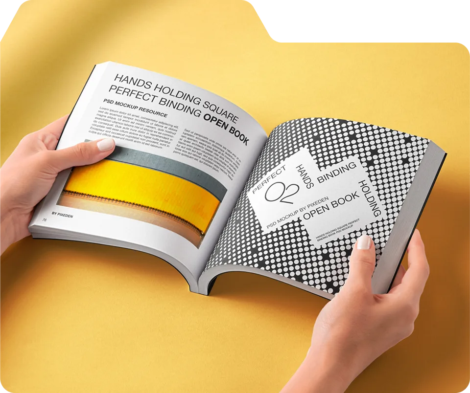
Binding is a significant cost variable that many clients overlook. Saddle stitch (staples through the spine) is the most affordable binding option and is perfectly suited for magazines with 8–64 pages. It produces a clean, professional result and is the standard binding for most consumer and trade magazines.
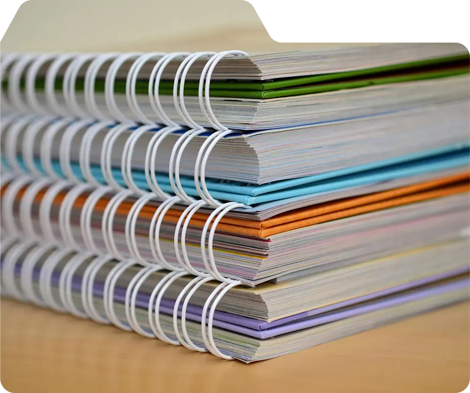
Perfect binding (flat glued spine) costs more and is only necessary for thicker publications (48+ pages) where a flat spine is required. Spiral and Wire-O binding cost even more. Unless your project specifically requires a thick spine or special format, saddle stitch is the smart choice.
Easy Win
Paper is one of the most noticeable places where clients upgrade unnecessarily. 80 lb. gloss text or 70 lb. matte text for interior pages delivers excellent color reproduction and a professional feel — at a significantly lower price than 100 lb. premium stocks.
Reserve premium paper upgrades for the cover only. A 100 lb. gloss or matte cover stock on standard interior text pages is the sweet spot that looks and feels high-end without inflating the full job cost.
Avoid Hidden Fees
When files are submitted that are not print-ready — wrong color mode, low-resolution images, missing bleed, unembedded fonts — printers must charge for prepress correction work. These fees are often invisible until the invoice arrives.
Submitting a properly formatted print-ready PDF (CMYK, 300 DPI, with 0.125″ bleed, fonts embedded) eliminates these charges entirely. Unique Print NY offers a complimentary prepress file review for all clients — submit your files early and we’ll flag any issues before they become costly corrections.
Most Avoidable Cost
Rush printing is expensive — and it’s the most avoidable cost on this entire list. Rush surcharges at most NYC printers add 25–50% to your total job cost. A $600 print job becomes $750–$900 simply because of a compressed timeline.
Submit your files 7–10 business days before your distribution deadline to use standard turnaround pricing. Build print production into your project timeline from day one — not as an afterthought. At Unique Print NY, standard turnaround is 5–7 business days with no rush premium required.
“The clients who get the best value from their print jobs are the ones who plan early, right-size their order, and submit clean files. Those three habits alone can cut a magazine printing budget in half.”
— Unique Print NY Production Team
Budget Magazine Printing: Cost Comparison at a Glance
Here’s how different specification choices affect the total cost of a standard 32-page, 8.5″ × 11″ magazine printed at Unique Print NY in New York City:
| Specification | Budget Choice | Premium Choice | Est. Cost Difference |
|---|---|---|---|
| Binding | Saddle Stitch ✓ | Perfect Bound | Save ~20% |
| Interior Paper | 80 lb. Gloss Text ✓ | 100 lb. Gloss Text | Save ~15% |
| Page Count | 32 pages ✓ | 48 pages | Save ~25% |
| Size | 8.5″ × 11″ Standard ✓ | Custom / Oversized | Save ~10% |
| Turnaround | Standard 5–7 days ✓ | Rush 2–3 days | Save 25–50% |
| File Preparation | Print-ready PDF ✓ | Files needing correction | Save $50–$200+ |
How Much Can You Actually Save?
Applying all seven strategies to a typical first-time magazine print job in New York City can reduce costs by 40–60% compared to a job with unoptimized specifications. For example:
- A 500-copy, 48-page, perfect-bound magazine on premium stock with rush turnaround might cost ~$4,800.
- The same distribution goal achieved with 500 copies, 32 pages, saddle stitch, standard stock, and standard turnaround could cost ~$2,200–$2,600 — a saving of $1,800–$2,600 on a single print run.
The quality difference between these two jobs? Minimal to none — if your design is strong, the audience will never notice the spec differences. What they’ll notice is the editorial content, the photography, and the brand voice.
Which Magazine Type Are You Printing?
Here’s how the budget recommendations apply across the most common magazine types we print at Unique Print NY:
Best Budget Spec
100–250 copies · 32 pages · 8.5×11 · Saddle stitch · 80 lb. gloss text · Standard turnaround
Best Budget Spec
250–500 copies · 24–32 pages · 8.5×11 · Saddle stitch · 80 lb. gloss text · Order 2 weeks ahead
Best Budget Spec
100–250 copies · 32 pages · 8.5×11 · Saddle stitch · 80 lb. gloss text · Soft-touch cover only
Best Budget Spec
100–500 copies · 32–48 pages · Digest or standard · Saddle stitch · 70 lb. matte text
Best Budget Spec
500–1,000 copies · 32 pages · 8.5×11 · Saddle stitch · 80 lb. matte text · Standard turnaround
Best Budget Spec
250–500 copies · 32 pages · 8.5×11 · Saddle stitch · 80 lb. gloss text · Plan 2 weeks ahead
Frequently Asked Questions
Ready to Print Your Magazine in NYC?
Get a free, no-obligation quote from Unique Print NY. Transparent pricing, expert guidance, and premium results — every time.
Quick turnaround Available · NYC pickup available
How to design a magazine for professional printing in NYC? Set your document to the correct trim size (e.g., 8.5″ × 11″), add 0.125″ bleed on all sides, set safe margins of at least 0.25″ from the trim edge, ensure all images are 300 DPI at final size, design in CMYK color mode (not RGB), and export as a print-ready PDF/X-1a or PDF/X-4 with fonts embedded. Unique Print NY at 242 West 36th Street, New York, NY 10018 performs a complimentary prepress file review on every magazine printing order. Call (212) 420-9198 Monday–Friday 9AM–5PM.
Designing for print is fundamentally different from designing for digital screens. Colors behave differently, margins must account for trimming and binding, image resolution must meet professional standards, and a single overlooked setting can mean the difference between a magazine that prints perfectly and one that needs to be remade from scratch.
At Unique Print NY, our prepress team reviews every file before it goes to press. The issues we catch most often — incorrect bleed, low-resolution images, RGB color mode, missing fonts — are all completely preventable with the right setup from the start. This guide covers every design and technical requirement for professional magazine printing in New York City, so your files print exactly the way you designed them.
1. Choosing the Right Magazine Size
Before you open your design software, confirm your final trim size. This is the most fundamental decision in magazine production — everything else (bleed, margins, spine width, paper coverage) is calculated relative to this number. Changing your trim size after layout has begun is expensive and time-consuming.
| Size | Dimensions | Best For | Cost Level |
|---|---|---|---|
| Standard US Letter | 8.5″ × 11″ | Most magazines — versatile, economical, familiar | Most affordable |
| Traditional Magazine | 8.375″ × 10.875″ | Trade and consumer publications matching newsstand format | Affordable |
| Digest | 5.5″ × 8.5″ | Literary journals, compact lookbooks, press kits | Most affordable |
| Large Format | 9″ × 12″ | Fashion, photography, premium brand publications | Mid-range |
| Square | 8″ × 8″ or 9″ × 9″ | Contemporary brands, Instagram-native aesthetic | Mid-range |
| Oversized / Tabloid | 11″ × 14″ | Art-book format, statement luxury publications | Premium |
Call (212) 420-9198 or visit 242 West 36th Street before beginning your layout. Confirming the exact trim size upfront avoids the most common and costly design-to-print mismatch we see — documents set up at the wrong dimensions.
2. Understanding and Setting Up Bleed
Bleed is one of the most important — and most frequently missing — elements in magazine files submitted for print. Without it, the trimming process creates unintended white borders along the edges of pages that should have color or imagery running to the edge.
What Bleed Is
When a magazine is printed and trimmed, the cutting process has a small tolerance — typically 1/16″ in either direction. Bleed is the area of your design that extends beyond the final trim line to account for this variation. It ensures that backgrounds, full-bleed photographs, and edge-to-edge graphic elements reach the very edge of the trimmed page, no matter where the cut falls.
Standard Bleed Requirement at Unique Print NY
Required for All Print Jobs
Every element intended to reach the edge of the page — backgrounds, photographs, color fills, graphic borders — must extend 0.125 inches (⅛”) beyond the trim line on all four sides.
Example: If your magazine trim size is 8.5″ × 11″, your document with bleed should be set up at 8.75″ × 11.25″. Your full-bleed background or image must fill this entire larger area — not stop at the trim line.
Critical rule: Never place important content — text, logos, key imagery — inside the bleed area. This zone will be trimmed off. All essential content must sit within the safe zone, at least 0.125″ inside the trim line.
Set in: InDesign → Document Setup · Illustrator → Artboard · Photoshop → Canvas size
How to Set Up Bleed in Design Software
- Adobe InDesign: File → Document Setup → Bleed and Slug → set all four sides to 0.125″
- Adobe Illustrator: File → Document Setup → Bleed → set all four sides to 0.125″
- Adobe Photoshop: Increase canvas size by 0.25″ in both width and height — ensure your background layer fills the entire expanded canvas
- Canva Pro: Use the “Add bleed” option in the download settings — Canva adds 0.125″ automatically on Pro plans
3. Safe Margins and the Live Area
While bleed protects the outer edges of your design, safe margins protect your content. The safe margin (also called the live area) is the zone inside the trim line where all critical elements — text, logos, call-to-action buttons, important imagery — must be placed to ensure they are never accidentally clipped during trimming.
| Margin Type | Recommended Distance from Trim | Use Case |
|---|---|---|
| Minimum Safe Margin | 0.25″ (6mm) | Standard magazines — minimum acceptable distance |
| Preferred Safe Margin | 0.375″ (10mm) | Premium publications — more comfortable visual breathing room |
| Inside Margin (Perfect Bound) | 0.5″ minimum | Allows for spine thickness — content won’t disappear into the gutter |
| Inside Margin (Saddle Stitch) | 0.375″ minimum | Standard — pages lie flat, gutter margin less critical |
Beyond preventing content from being clipped, generous margins improve readability, create visual breathing room, and signal editorial quality. Luxury and premium publications consistently use wider margins than minimum requirements — they communicate that there is space for the reader’s eye to rest, which subconsciously elevates the publication’s perceived quality.
4. Image Resolution: The 300 DPI Standard
Low-resolution images are the most common cause of poor print quality — and one of the most frequently caught issues in Unique Print NY’s prepress review. An image that looks perfectly sharp on a screen at 72 DPI will print blurry, soft, and pixelated at magazine size.
| DPI | Used For | Suitable for Print? | Result if Printed |
|---|---|---|---|
| 72 DPI | Web, social media, screen display | ✗ No | Blurry, pixelated, unprofessional |
| 150 DPI | Low-quality print output | ✗ No | Soft, lacks sharpness |
| 300 DPI | Professional print — standard | ✦ Yes — required | Sharp, clear, professional quality |
| 400–600 DPI | Fine art printing, specialty reproduction | ✦ Yes — premium | Maximum sharpness for close inspection |
The Most Important Rule About Resolution
Resolution is fixed at the time an image is captured or created — you cannot increase it by changing the DPI setting in Photoshop. Changing an image from 72 DPI to 300 DPI in Photoshop’s Image Size dialog (without resampling) simply changes how the image is interpreted, not how much actual image data exists. An image sourced from a website at 72 DPI will print at 72 DPI quality regardless of what the metadata says.
The only way to get a print-quality image is to:
- Shoot or commission photography at high resolution (RAW files from modern cameras are typically well above 300 DPI at standard print sizes)
- Purchase high-resolution stock photography (always check the download size — most stock sites offer “print resolution” download options)
- Create vector graphics in Adobe Illustrator — vectors are resolution-independent and always print at maximum quality regardless of size
Go to Window → Info panel. Click on any placed image. The Actual PPI value shown is the true print resolution of that image at its current size in the layout. If it reads below 300 PPI, the image needs to be replaced with a higher-resolution version — resizing it smaller in the layout will increase the effective DPI.
5. Color Mode: CMYK Is Non-Negotiable for Print
Every professional print job — including all magazine printing at Unique Print NY — requires files in CMYK color mode. Designing in RGB (the color mode used by digital screens) and converting at the end frequently causes unexpected color shifts, particularly in blues, purples, and vivid saturated colors.
Essential Knowledge
RGB (Red, Green, Blue) creates color using light — it’s the color system of every digital screen. CMYK (Cyan, Magenta, Yellow, Black) creates color using ink on paper — it’s the color system of every commercial printing press.
Because RGB produces a wider range of colors than CMYK can reproduce in ink, some vivid screen colors cannot be accurately translated to print. Electric blues, neon greens, and vivid purples are the most commonly affected. When you design in CMYK from the start, you’re working within the actual color space your printer will use — eliminating the guesswork and the surprises.
Set in InDesign: File → Document Setup → Color Mode → CMYK
For a complete explanation of CMYK, how halftone printing works, which colors shift most in conversion, and how to soft proof your colors before printing, see our full guide: What Is CMYK? The Complete Guide for Magazine Designers →
6. Typography and Readability in Print
Typography that looks elegant on screen can become difficult to read in print if it’s not set up correctly. The physical act of printing introduces variables — ink spread, paper texture, viewing distance — that don’t exist on a screen. Here are the critical typography rules for magazine printing:
Readability Standard
Body text in a professionally printed magazine should be a minimum of 9pt, with 10–11pt preferred for most publications. Text below 9pt becomes genuinely difficult to read in print, particularly on coated stocks where ink sits on the surface and can spread slightly. For publications targeting older audiences or any context where ease of reading is paramount, 11–12pt body text is the better choice.
Common Print Mistake
Hairline and ultra-light font weights (100–200 weight) that look sophisticated on high-resolution screens can become nearly invisible in print, particularly when set in light colors against a background. The ink spread inherent in commercial printing causes very thin strokes to appear even thinner or to break apart entirely. Use ultra-thin weights for display purposes only — never for body text or captions.
Legibility Requirement
Light grey text on a white background may appear readable on a calibrated monitor but will often be nearly illegible when printed, particularly on matte or uncoated stocks where contrast is naturally softer. As a rule, body text should be black (K:100) or very dark on light backgrounds, and white or very light on dark backgrounds. Avoid mid-tone text on mid-tone backgrounds at all times.
File Requirement
When you export your magazine as a PDF, all fonts used in the document must be embedded — meaning the font data is included within the PDF file itself. If fonts are not embedded, the printer’s system substitutes a default font, completely altering your typography and layout. PDF/X-1a and PDF/X-4 export presets handle font embedding automatically when configured correctly.
7. Spine Design for Perfect Bound Magazines
If your magazine will be perfect bound (flat glued spine, like a paperback), the spine requires its own design consideration. Unlike saddle-stitched magazines — which have no visible spine — perfect-bound publications have a flat spine that is visible on a bookshelf or display rack and must be designed separately.
How Spine Width Is Calculated
Spine width is determined by two factors: page count and paper thickness (GSM or lb weight). There is no universal formula — different paper stocks have different thickness values, and the calculation must account for both the interior pages and the cover stock.
- A 32-page magazine on 80 lb. text stock has a significantly narrower spine than a 64-page magazine on 100 lb. text stock
- Spine width is typically expressed in fractions of an inch or millimeters
- Most spines for short-run magazines range from 0.125″ to 0.5″ depending on page count and stock
An incorrectly sized spine causes the cover to wrap incorrectly — the spine text shifts off-center, the front cover bleeds onto the back, or the back cover extends onto the front. Always request exact spine measurements from Unique Print NY once your page count and paper stock are finalized. Call (212) 420-9198 and our team will calculate this for you before you design the cover.
8. Layout, Grid, and Visual Hierarchy
Technical file setup ensures your magazine can be printed — but it’s layout quality that determines whether it reads like a professional publication or an amateur one. Here are the foundational layout principles used by professional magazine designers:
Foundation of Professional Layout
Establish a column grid at the start of your layout and apply it consistently throughout the magazine. A grid creates visual coherence across pages — readers sense order and professionalism even if they can’t articulate why.
Reader Navigation
Every page should have a clear hierarchy: headline → subheading → body text → caption. Size, weight, and color distinguish levels. Readers should be able to scan a page and immediately understand what is most important.
Marks Premium Quality
Negative space is not wasted space — it’s breathing room for the reader’s eye. Cluttered pages feel overwhelming and low-quality. Generous white space elevates design, improves readability, and communicates editorial confidence.
Brand Cohesion
Use paragraph styles in InDesign to apply consistent heading levels, body text, and caption styles throughout the document. This ensures visual consistency and makes late-stage revisions significantly faster and safer.
Editorial Balance
Different magazine types use different ratios — fashion lookbooks may be 80% imagery, corporate publications 60% text. Whatever your ratio, maintain it consistently and intentionally across sections. Inconsistency feels unplanned.
User Experience
Design spreads (two-page layouts) as unified compositions. The reader’s eye moves left to right, top to bottom. Place dominant imagery and headlines where the eye naturally lands first — the upper-left quadrant of the left page on a spread.
9. Common Magazine Design Mistakes to Avoid
Most Common
Designing at the exact trim size with no bleed extension. When the magazine is cut, white borders appear along any edge that should have had color or imagery reaching the edge. Fix: Set up your document with 0.125″ bleed on all sides before beginning layout.
Very Common
Using images downloaded from websites (typically 72 DPI) that look sharp on screen but print blurry and pixelated. Fix: Check every image’s actual DPI in InDesign’s Info panel before exporting. Replace any image below 300 DPI at its final placed size.
Very Common
Starting the layout in RGB because it’s the software default, then converting to CMYK at export. Late conversion often causes color shifts across the entire design. Fix: Set your document to CMYK color mode before placing a single element.
Frequent Issue
Placing body text, captions, or logos within 0.125″ of the trim line. Even a small trimming variation clips this content. Fix: Keep all critical text and imagery at least 0.25″ inside the trim line at all times.
Production Issue
Submitting a magazine with a page count that is not a multiple of 4 (e.g., 30, 38, or 50 pages). Magazines print in groups of 4 pages — any non-multiple creates blank pages or a production error. Fix: Always plan your content for 8, 16, 24, 32, 48, or 64 pages.
File Error
Exporting a PDF without font embedding enabled. The printer’s system substitutes a default font, changing your typography and potentially breaking your layout. Fix: Always use PDF/X-1a or PDF/X-4 export presets — these embed fonts automatically.
10. Pre-Export Checklist: Preparing Your Print-Ready PDF
Before exporting your final file, run through this complete checklist. Unique Print NY’s prepress team checks every one of these items on every job — but catching them yourself before submission eliminates delays.
- Document color mode is CMYK — not RGB
Check in InDesign: File → Document Setup → Color Mode. Every element, placed image, and graphic should be in CMYK. - All images are 300 DPI at final placed size
Use InDesign’s Links panel (Window → Links) to check the Effective PPI column for every placed image. All should read 300 or higher. - Bleed is set to 0.125″ on all four sides
Verify in Document Setup. Confirm that full-bleed backgrounds and images actually extend to fill the bleed area — not just the trim boundary. - Critical content is within the 0.25″ safe zone
No text, logos, or important imagery is closer than 0.25″ to the trim edge. Inside margins for perfect-bound magazines are at least 0.5″. - Page count is a multiple of 4
Count your pages. If the total is not 8, 16, 24, 32, 48, or 64 — add blank pages to reach the next multiple of 4. - Export as PDF/X-1a or PDF/X-4 with crop marks and bleed
In InDesign: File → Export → Adobe PDF (Print) → choose PDF/X-1a or PDF/X-4 preset. Under Marks and Bleeds, enable crop marks and set bleed to 0.125″. - Submit for a free prepress review at Unique Print NY
Email or bring your files to 242 West 36th Street, New York, NY 10018 or call (212) 420-9198. Our prepress team reviews every file before production — at no charge — and flags any issues before they become print errors.
Frequently Asked Questions
Ready to Print Your Magazine in NYC?
Get a free, no-obligation quote from Unique Print NY. Our expert team guides you through every step — from file preparation to final delivery — at 242 West 36th Street, Midtown Manhattan.
242 West 36th Street, New York, NY 10018 · (212) 420-9198 · Mon–Fri 9AM–5PM