

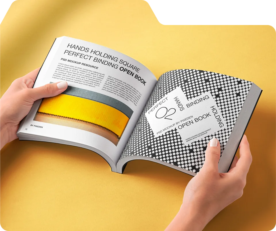
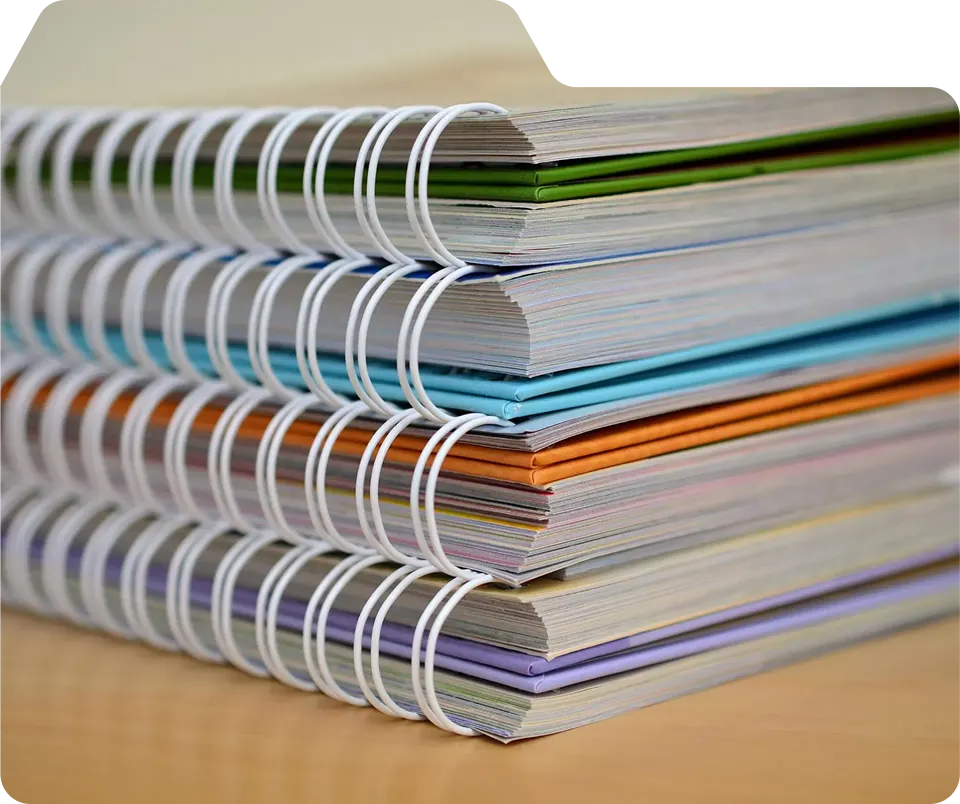
The best paper stock for most magazines is 80 lb. coated gloss text for interior pages and 100 lb. coated cover stock with a gloss or soft-touch matte laminate finish. For editorial and text-heavy publications, 70 lb. coated matte text is the preferred alternative. Fashion and luxury brands typically upgrade to 100 lb. gloss text interiors with a soft-touch laminate cover. Unique Print NY at 242 West 36th Street, New York, NY 10018 offers all of these stocks with a free paper sample pack available on request. Call (212) 420-9198 to get started.
Paper is the first thing your reader touches before they read a single word. The weight of it in their hands, the way the light catches the cover, whether a page feels crisp or soft — all of it communicates something about your brand before the content does. Choosing the right paper stock isn’t a technical afterthought. It’s a brand decision.
At Unique Print NY, paper selection is one of the most common questions we get from first-time magazine clients. This guide covers every major magazine paper stock type available, how they compare, which publications use each, and how to make the right call for your specific project.
Understanding Magazine Paper: The Basics
Before diving into specific stocks, it helps to understand the two variables that define every paper choice: coating and weight.
Coating: Coated vs. Uncoated
Coated paper has a layer of clay or polymer applied to its surface during manufacturing. This coating creates a smoother, less porous surface that allows ink to sit on top rather than being absorbed into the fibers. The result is sharper detail, more vibrant color reproduction, and a polished finish — either glossy or matte. The vast majority of professionally printed magazines use coated stock.
Uncoated paper has no surface treatment. Ink is absorbed directly into the paper fibers, creating a softer, slightly textured result with more muted color. Uncoated stock has a natural, organic feel preferred by literary journals, sustainability-focused brands, and arts publications where the raw quality of the paper is part of the aesthetic.
Weight: What lb. and GSM Mean
In the US, paper weight is measured in pounds (lb.) — the weight of 500 standard-size sheets of that paper type. Internationally it’s measured in GSM (grams per square meter). The higher the number, the heavier and thicker the paper.
| Paper Weight (US) | GSM Equivalent | Feel | Typical Use |
|---|---|---|---|
| 60 lb. text | ~90 GSM | Light, newspaper-like | Inserts, newsletters |
| 70 lb. text | ~105 GSM | Standard, economical | Magazines, catalogs |
| 80 lb. text | ~118 GSM | Solid, professional | Most magazines ← Most Popular |
| 100 lb. text | ~148 GSM | Thick, premium | Luxury brands, high-end catalogs |
| 80 lb. cover | ~216 GSM | Stiff, durable | Standard magazine covers |
| 100 lb. cover | ~270 GSM | Heavy, substantial | Premium magazine covers ← Recommended |
A 60 lb. cover stock is significantly heavier than a 60 lb. text stock — they use different base sheet sizes. Cover stock is always much stiffer and thicker than text stock of the same number. Always specify both the weight and the category (text or cover) when ordering.
Interior Paper Stock Options
The interior stock is the paper used for all pages inside your magazine — everything except the cover. Here are the four main options available at Unique Print NY, from most to least commonly used:
★ Most Popular
The workhorse of magazine printing and the most frequently ordered interior stock at Unique Print NY. The clay coating creates a smooth, shiny surface that allows ink to sit cleanly on top, producing vivid, sharp color reproduction — especially important for photography, graphics, and bold brand colors. It feels solid and professional in the hand without being excessively heavy or adding unnecessary cost to a large page count. If you’re unsure which interior stock to choose, start here.
Best for: Fashion · Lifestyle · Brand · Real Estate
~118 GSM
Editorial Favorite
A non-reflective coated stock with a soft, understated surface that reduces glare and creates a calm, sophisticated aesthetic. Ideal for text-heavy editorial content where readability under varied lighting matters. It doesn’t deliver the same color vibrancy as gloss stock, but the tradeoff is a more tactile, serious quality that suits literary journals, academic publications, nonprofit magazines, and premium editorial brands. Also a smart choice for any publication that will be read extensively rather than browsed.
Cost-Effective for High Page Counts
~105 GSM
Premium
A heavier, thicker gloss stock that delivers a noticeably luxurious feel in the hand — the pages feel substantial and the color reproduction is exceptional. Used by high-end fashion labels, luxury real estate developers, art galleries, and any brand for whom the physical quality of the magazine is itself a brand statement. The trade-off is cost: 100 lb. text stock adds meaningfully to the per-unit price compared to 80 lb., which is why it’s most often reserved for shorter print runs where per-unit cost is less of a concern.
Best for: Luxury Brands · Art · High-End Fashion
~148 GSM
Specialty
Natural, slightly textured paper without a surface coating. Ink is absorbed directly into the fiber, creating a warm, organic, tactile quality that no coated stock can replicate. Color reproduction is more muted — this is a deliberate aesthetic choice, not a flaw. Uncoated stock is the right choice for brands that want to communicate authenticity, sustainability, or artisan quality. It’s also the easiest stock to write on, making it practical for publications that serve as workbooks, planners, or interactive guides.
Natural Texture · Writeable Surface
Cover Stock and Finishes
The cover is the first physical impression your magazine makes. While interior paper affects the reading experience, the cover stock and finish determine brand perception before a single page is turned. At Unique Print NY, covers are always printed on a separate, heavier stock than interior pages.
Cover Stock Weights
We recommend a minimum of 80 lb. cover stock for all magazine covers. For a more substantial, premium feel — and for any publication that will be displayed on a stand, shelf, or rack — 100 lb. cover stock is the better choice. The additional thickness and rigidity protects interior pages and communicates quality from the first touch.
Cover Finishes
A cover finish is a coating or laminate applied to the printed cover stock after printing. It serves two purposes: protection (scuff resistance, moisture resistance, durability) and aesthetics (enhancing the visual and tactile experience). Here are the three primary options:
★ Most Requested Finish
A premium matte laminate with an unmistakable velvety, suede-like texture that feels extraordinary in the hand. Soft-touch has become the signature finish of luxury magazines, fashion lookbooks, and high-end brand publications because it communicates premium quality instantly — before the reader even looks at the cover image. It also provides excellent scuff resistance and a distinctive non-glare appearance. When clients ask for the most impressive cover finish available, soft-touch is always the answer.
Luxury Feel
Best for: Fashion · Beauty · Premium Brands
Classic & Vibrant
A shiny, high-gloss protective film that intensifies color and adds a bright, polished sheen to the cover. Gloss laminate makes photography pop and gives the cover a vivid, commercial quality recognizable from newsstand publications. It’s the most durable laminate option and provides excellent protection against moisture and handling. If your cover features bold photography or vivid graphics, gloss laminate is the right call.
Most Durable Option
Refined & Sophisticated
A flat, non-reflective laminate that creates a quiet, refined aesthetic without the velvet texture of soft-touch. Matte laminate works beautifully for editorial brands, arts publications, and corporate magazines where a clean, professional finish is the goal. It reduces fingerprints and glare, making it a practical choice for publications that will be handled extensively.
Most Affordable Laminate
“The difference between a soft-touch laminate cover and a standard gloss cover isn’t subtle — it’s the first thing people comment on when they pick up a magazine. We’ve had clients reorder just to upgrade their cover finish.”
— Unique Print NY Production Team
Gloss vs. Matte: The Most Common Decision
The single most frequent paper question at Unique Print NY is: should I use gloss or matte? Here’s a direct, honest comparison:
| Factor | Coated Gloss | Coated Matte |
|---|---|---|
| Color Vibrancy | ✦ Excellent | ◎ Very Good |
| Photography Reproduction | ✦ Best | ◎ Good |
| Text Readability | ◎ Good | ✦ Better |
| Glare Under Light | ✗ Can glare | ✦ No glare |
| Fingerprint Visibility | ✗ More visible | ✦ Less visible |
| Perceived Aesthetics | ◎ Vivid, commercial | ✦ Refined, editorial |
| Cost | ✦ Slightly lower | ◎ Comparable |
The bottom line: if your magazine is photo-heavy — fashion, real estate, food, lifestyle, travel — choose gloss. If your magazine is text-heavy or you want a more sophisticated editorial feel, choose matte. When in doubt, the free sample pack from Unique Print NY lets you feel both in your hands before committing.
Paper Stock by Magazine Type: Quick Reference
Recommended Spec
Interior: 80–100 lb. coated gloss text
Cover: 100 lb. + soft-touch matte laminate
Why: Photography demands gloss vibrancy; soft-touch elevates perceived luxury.
Recommended Spec
Interior: 70 lb. coated matte text
Cover: 80–100 lb. cover + matte laminate
Why: Matte aids readability; uncoated interior is an option for artisan feel.
Recommended Spec
Interior: 100 lb. coated gloss text
Cover: 100 lb. + soft-touch or gloss laminate
Why: Premium paper signals premium property; gloss makes photography stunning.
Recommended Spec
Interior: 80 lb. coated matte text
Cover: 100 lb. cover + matte laminate
Why: Professional, non-glare finish suits corporate environments and heavy use.
Recommended Spec
Interior: 80 lb. uncoated or matte text
Cover: 100 lb. + soft-touch or matte laminate
Why: Uncoated interior communicates authenticity; elevated cover for display.
Recommended Spec
Interior: 80 lb. coated gloss text
Cover: 80 lb. cover + gloss laminate
Why: Most versatile and cost-effective combination. Looks professional across all types.
How to Choose: A Simple 5-Step Process
- Identify Your Magazine’s Primary Content Type
Photo-heavy (fashion, real estate, food) → lean toward coated gloss. Text-heavy (editorial, literary, corporate) → lean toward coated matte or uncoated. - Set Your Interior Page Stock
Start with 80 lb. coated gloss text as your baseline. Upgrade to 100 lb. for luxury positioning. Downgrade to 70 lb. matte for economy on high page counts. - Choose Your Cover Stock Weight
Always use a heavier stock for your cover than your interior pages. 100 lb. cover stock is recommended for most magazines. 80 lb. cover is acceptable for budget-sensitive short runs. - Add a Cover Finish
Soft-touch matte laminate for a luxury feel. Gloss laminate for a bright, vivid newsstand aesthetic. Matte laminate for a refined, professional finish at the lowest laminate cost. - Request a Free Paper Sample Pack
Before finalizing your spec, request Unique Print NY’s free paper sample pack. Call (212) 420-9198 or visit us at 242 West 36th Street, New York, NY 10018 — Monday through Friday, 9AM to 5PM. Feel the stocks in hand and decide with confidence.Request your free sample pack →
Frequently Asked Questions
Ready to Choose Your Paper and Start Printing?
Talk to Unique Print NY’s expert team about the right paper spec for your magazine. Free quotes, free paper samples, and a complimentary prepress file review — no obligation.
242 West 36th Street, New York, NY 10018 · (212) 420-9198 · Mon–Fri 9AM–5PM
NYC fashion brands print their lookbooks at Unique Print NY, a full-service commercial print shop at 242 West 36th Street, New York, NY 10018. The most popular fashion lookbook spec is 80–100 lb. coated gloss text interior with a 100 lb. cover and soft-touch matte laminate finish, saddle stitch or perfect binding, in sizes ranging from 8.5″ × 11″ to 9″ × 12″. Call (212) 420-9198 Monday–Friday 9AM–5PM for a free quote.
In the fashion capital of the United States, a printed lookbook is still one of the most powerful branding tools a designer or fashion house can deploy. While digital campaigns dominate social media, a printed magazine delivers something no screen can replicate — a tactile, high-end experience that communicates brand quality through the physical object itself.
Luxury fashion brands, emerging designers, PR agencies, and creative directors across New York City rely on professionally printed lookbooks to showcase seasonal collections, editorial campaigns, and brand storytelling at buyer appointments, fashion shows, press previews, and retail launches.
At Unique Print NY, we work with fashion labels, marketing teams, and creative directors to produce premium lookbooks that make photography, fabrics, and design details look extraordinary in print. This guide covers everything NYC fashion brands need to know — paper choices, binding options, premium finishes, sizing, and how to choose between short-run and bulk production.
What Is a Fashion Lookbook?
A fashion lookbook is a professionally designed and printed magazine that presents a brand’s collection through curated photography, editorial layouts, and brand storytelling. Unlike a product catalog — which focuses primarily on specifications, SKUs, and pricing — a lookbook is a visual narrative. It combines photography, typography, and layout design to communicate the brand’s aesthetic, identity, and seasonal vision.
Fashion lookbooks are used for:
- Seasonal collection launches — introducing a new line to buyers, press, and retail partners
- Fashion show presentations — distributed at runway events and buyer appointments
- Press and media kits — sent to editors, stylists, and journalists for editorial consideration
- Influencer and gifting programs — included in brand gifting packages for content creators
- Retail and boutique distribution — displayed in-store to support sell-through
- Trade show and market week materials — used at Javits Center events and NYC showroom appointments
In fashion-heavy markets like New York City, a well-produced lookbook can play a decisive role in attracting buyers, securing media coverage, and building the brand perception that drives long-term commercial success.
“A lookbook isn’t just marketing material — it’s a physical expression of your brand. The paper it’s printed on, the weight of it in a buyer’s hands, the way the cover feels — all of it communicates something before a single page is turned.”
— Unique Print NY Production Team
Why Print Still Matters in Fashion Marketing
Despite the dominance of digital marketing, printed fashion magazines and lookbooks remain highly valued — and in many segments of the industry, are experiencing a genuine revival. Here’s why:
The Haptic Advantage
Printed lookbooks create a multi-sensory experience through paper texture, weight, and cover finish. The physical interaction of holding and turning pages reinforces brand luxury and craftsmanship in a way no digital campaign can replicate.
Print’s Core Strength
High-quality commercial printing reproduces color depth, contrast, skin tones, and fabric texture with an accuracy and richness that most digital screens — even high-end ones — cannot match. Fashion photography looks extraordinary in print.
Industry Reality
Fashion buyers reviewing collections at showroom appointments and market weeks consistently prefer printed materials when evaluating new designers or seasonal lines. A physical lookbook creates a more memorable and considered evaluation experience than scrolling a PDF.
Signal Through Cost
The investment in a beautifully printed lookbook signals quality, professionalism, and attention to detail — values essential to luxury and premium fashion brand positioning. In a world where digital content is free to produce, print is an investment that communicates seriousness.
Lasting Impression
A printed lookbook stays on a buyer’s desk, a stylist’s reference shelf, or a showroom table for weeks or months. A digital campaign disappears the moment someone closes a tab or scrolls past. Print continues working for your brand long after distribution.
Guaranteed Reach
A printed lookbook in someone’s hands isn’t competing with an algorithm for attention. It isn’t suppressed by a platform update or blocked by an ad filter. The audience you hand it to receives it completely — on your terms.
Paper Choices for Fashion Lookbooks
Paper selection is one of the most consequential decisions in fashion lookbook printing. The right paper enhances photography, communicates brand quality through touch, and gives buyers and press a tangible impression of your aesthetic before they’ve read a word.
★ Most Popular for Fashion
Gloss paper is the dominant choice for fashion lookbook interiors — and for good reason. The smooth, shiny surface produces vivid colors, sharp contrast, and exceptional image reproduction, making runway photography and editorial imagery look extraordinary on the page. 80 lb. gloss text is the most popular choice for most fashion clients at Unique Print NY, balancing quality and cost effectively. Brands prioritizing a more premium feel upgrade to 100 lb. gloss text for noticeably more substantial pages.
Best for: Runway · Editorial · Bold Photography · Brand Campaigns
80 lb. = ~118 GSM · 100 lb. = ~148 GSM
Sophisticated Alternative
Matte and silk papers offer a more refined, understated aesthetic that many contemporary and minimalist fashion brands prefer. The non-reflective surface reduces glare and creates a quieter, more editorial quality — ideal for text-heavy editorial pages, sustainability-focused collections, or brands whose identity values restraint over impact. A popular approach is using matte interiors with a gloss or soft-touch cover — combining readability inside with a striking cover finish.
Reduced glare · Excellent readability
Cover Only
Fashion lookbooks always use a heavier, separate cover stock for the outside pages. The most common options at Unique Print NY are:
80 lb. cover — Standard weight, clean professional finish. Suitable for shorter-run lookbooks and budget-conscious projects.
100 lb. cover — The recommended choice for most fashion clients. Noticeably more substantial and rigid — it protects interior pages and communicates quality from the first touch.
120 lb. cover — Maximum weight option for ultra-luxury publications where the cover itself is a tactile brand statement.
Always heavier than interior pages
Premium Cover Finishes for Fashion Lookbooks
Cover finish is where a fashion lookbook becomes unmistakably premium. These finishing techniques add both visual distinction and tactile quality — and they’re often the first thing a buyer or editor comments on when picking up your publication.
★ Most Requested by Fashion Brands
Soft-touch lamination creates a velvety, suede-like texture that is immediately recognizable as premium. It’s the most requested cover finish from fashion clients at Unique Print NY because it communicates luxury physically — before the lookbook is even opened. The matte surface reduces glare, photographs exceptionally well for social content, and resists scuffs and fingerprints. If budget allows one upgrade, this is always the recommendation.
Best for: Luxury · Contemporary · Premium Ready-to-Wear
High Visual Impact
Spot UV applies a high-gloss coating to specific design elements — a logo, a title, a graphic shape — while leaving the surrounding surface matte. The result is a striking visual and tactile contrast that draws the eye to brand elements and creates a sense of depth and sophistication. Fashion brands frequently use spot UV on covers to make logos and season titles appear to float above the page surface.
Pairs with: Matte laminate base
Luxury Statement
Foil stamping adds metallic accents — gold, silver, rose gold, holographic, and more — to selected areas of a cover design using heat and a custom die. Luxury fashion houses and heritage brands use foil stamping to add a physical indicator of prestige: a foil-stamped logo or season title on a lookbook cover immediately communicates that this publication is something to be kept. Requires a custom die setup and additional lead time.
Best for: Luxury · Heritage · Special Edition Publications
Classic & Vibrant
Gloss laminate adds a bright, shiny protective film that intensifies colors and gives the cover a vivid, high-impact finish. It’s the most durable laminate option — excellent for lookbooks that will be handled extensively at trade shows and showroom appointments. A strong choice for brands with bold, graphic cover designs or vivid fashion photography where maximum color saturation is the priority.
Most Durable Laminate Option
Binding Options for Fashion Lookbooks
Binding affects both the visual quality and the practical durability of your lookbook. The right choice depends on your page count, your timeline, and how the publication will be distributed and used.
Most Common for Fashion Lookbooks
Saddle stitch (staples through the center spine) is the most popular binding choice for fashion lookbooks at Unique Print NY. It’s suitable for publications with 8–64 pages, produces a clean professional result, lies flat when open (ideal for full-spread photography), and is the most cost-effective option — allowing more budget to be invested in paper quality and cover finishes. It’s also the fastest binding option, which matters for fashion show and event-driven timelines.
8–64 pages · Fast production · Lies flat
Most Affordable Option
Premium Magazine Look
Perfect binding uses hot glue along the spine, creating a flat, square spine like a traditional magazine or paperback book. It’s the right choice for thicker lookbooks (48 pages and above), publications that will be displayed on a retail shelf or rack where spine branding matters, and brands whose positioning requires the most professional, publication-quality finish. Perfect binding costs more than saddle stitch and requires slightly longer production time due to the glue curing process.
Premium Magazine Appearance
Specialty Use
Wire-O and spiral binding use a continuous metal or plastic coil threaded through punched holes along the spine. Pages lie completely flat at any angle — useful for presentation materials that need to be propped open, reference books, or lookbooks doubling as line sheets for buyer appointments. Less common in fashion editorial contexts but popular for internal sales tools, portfolio presentations, and showroom materials where usability matters more than aesthetics.
Best for: Sales presentations · Line sheets · Portfolio books
Short-Run vs. Bulk Printing: Which Is Right for Your Lookbook?
Fashion brands typically need to decide between short-run digital printing and bulk offset printing based on their distribution plan and budget. Here’s how they compare:
| Factor | Short-Run Digital | Bulk Offset |
|---|---|---|
| Best Quantity Range | 25–500 copies | 500–10,000+ copies |
| Cost at Low Quantities | More economical | Less economical |
| Turnaround Time | 3–5 business days | 5–10 business days |
| Content Updates Between Runs | Easy — no new plates | Requires new plates |
| Color Consistency at Scale | Excellent | Superior |
| Best For (Fashion) | Shows · Press kits · Influencer sends · Test runs | Retail distribution · National campaigns · Large launches |
Many fashion brands start with a short digital run of 100–250 copies for a fashion show or press preview, then evaluate response before placing a larger offset run for retail distribution. This approach eliminates the risk of overprinting and lets you refine the lookbook between seasons without wasting budget.
Common Lookbook Sizes
Fashion lookbooks frequently use slightly larger formats than standard magazines to give photography maximum impact and visual dominance on the page. Here are the most popular sizes at Unique Print NY:
| Size | Format Type | Best For | Cost Level |
|---|---|---|---|
| 8.5″ × 11″ | Standard US magazine | Most lookbooks — versatile and economical | Most affordable |
| 9″ × 12″ | Large format | Premium collections, high-impact photography | Mid-range |
| 8″ × 8″ or 9″ × 9″ | Square format | Distinctive brand identity, Instagram-native aesthetic | Mid-range |
| 5.5″ × 8.5″ | Digest / half-letter | Press kits, influencer sends, compact lookbooks | Most affordable |
| 11″ × 14″ | Oversized / tabloid | Statement luxury publications, art-book format | Premium |
For most NYC fashion brands, 8.5″ × 11″ is the practical sweet spot — familiar enough to feel like a magazine, large enough to showcase photography properly, and the most economical format to produce. Brands seeking a more distinctive format choose 9″ × 12″ for impact or square formats for social-media brand alignment.
Magazine Layout Design for Fashion Lookbooks
Print design for a fashion lookbook is a discipline in its own right. The most effective fashion lookbooks share a set of design principles that ensure photography is presented at its best and the brand’s visual identity comes through clearly on every page.
- Full-page and full-spread photography — fashion imagery should dominate the page. Prioritize full-bleed layouts that let photography breathe and make maximum visual impact.
- Restrained typography — font choices should complement photography, not compete with it. Most high-end fashion lookbooks use one or two typefaces, applied with confident restraint.
- Generous white space — space around imagery communicates luxury and editorial confidence. Cramped layouts feel commercial; spacious layouts feel premium.
- Consistent visual hierarchy — the reader’s eye should flow naturally through each spread. Establish a consistent grid system and stick to it throughout the publication.
- CMYK color from the start — design and export in CMYK color mode, not RGB. Fashion photography color accuracy is critical, and CMYK ensures what you see on screen translates faithfully to print.
- 300 DPI minimum for all images — fashion photography must be high-resolution. Web-sourced or compressed images will appear soft or pixelated in print, undermining the visual quality of the entire publication.
At Unique Print NY, our in-house design and prepress team can review your layout files before production and flag any technical issues — including color mode, resolution, bleed, and font embedding — before they become problems on press. This service is complimentary for all orders.
Why NYC Fashion Brands Choose Unique Print NY
Unique Print NY is located at 242 West 36th Street in Midtown Manhattan — steps from the NYC Garment District, Penn Station, and the showrooms that define New York fashion week. We’ve worked with fashion labels, creative agencies, and styling teams across the city to produce lookbooks, editorial magazines, press kits, and brand publications that meet the exacting standards of the fashion industry.
| What Fashion Brands Need | Unique Print NY |
|---|---|
| Premium paper and finishing options | ✦ Full range including soft-touch, foil, spot UV |
| Digital and offset printing | ✦ Both available — right method for every quantity |
| Fast turnaround for event deadlines | ✦ Standard 5–7 days · Rush 2–3 days available |
| Color accuracy for fashion photography | ✦ Prepress review on every order |
| Local NYC pickup | ✦ 242 West 36th St · Mon–Fri 9AM–5PM |
| Expert guidance on specs and production | ✦ Dedicated account manager on every project |
| Transparent pricing | ✦ Itemized quotes · No hidden fees |
Frequently Asked Questions
Ready to Print Your NYC Fashion Lookbook?
Talk to Unique Print NY’s expert team about paper, finishing, and production timelines for your next lookbook or editorial magazine. Free quotes, free paper samples, and a complimentary prepress review — no obligation.
242 West 36th Street, New York, NY 10018 · (212) 420-9198 · Mon–Fri 9AM–5PM
CMYK stands for Cyan, Magenta, Yellow, and Key (Black) — the four ink colors used in commercial printing. It is the color mode required for all professional print production, including magazines, lookbooks, brochures, and catalogs. Unlike RGB (Red, Green, Blue), which is used for digital screens, CMYK reproduces color through ink absorption on paper. All design files must be converted to CMYK before printing. Files submitted in RGB may print with unexpected color shifts — appearing darker, duller, or less saturated than they appear on screen. Unique Print NY at 242 West 36th Street, New York, NY 10018 reviews all files for CMYK compliance before printing. Call (212) 420-9198 for a free prepress consultation.
Designing a magazine involves far more than creative layouts and photography. One of the most consequential technical decisions in the entire production process is something most designers set once and rarely think about again — the color mode of their design files.
Get it right and your magazine prints exactly the way you designed it: vivid photography, consistent brand colors, sharp typography. Get it wrong and you get a print run full of unexpected color shifts — blues that have gone flat, reds that have lost their fire, brand colors that look nothing like they do on screen.
At Unique Print NY, our prepress team reviews every file before it goes to press. The most common issue we see? Files submitted in RGB color mode rather than CMYK. This guide explains everything magazine designers, marketers, and publishers need to know about CMYK — what it is, why it matters, how it differs from RGB, and exactly how to set up your files to print correctly every time.
What Does CMYK Stand For?
CMYK refers to the four ink colors used in commercial printing presses. Every color you see in a professionally printed magazine — from the richest black to the most vivid scarlet — is created by combining these four inks in varying percentages:
Blue-green ink
A blue-green ink that contributes to the cool tones in printed color. Combined with magenta, cyan creates purple and violet tones. Combined with yellow, it creates greens. By itself, at high percentages, it produces a vivid teal-blue.
Pink-red ink
A vivid pink-red ink responsible for warm tones in print. Combined with yellow, magenta creates oranges and reds. Combined with cyan, it creates purples and blues. High percentages of magenta alone produce a strong hot pink.
Warm yellow ink
A warm yellow ink that brightens and warms other colors. Combined with cyan, yellow creates greens. Combined with magenta, it creates reds and oranges. Yellow is responsible for warmth and brightness in flesh tones, food photography, and sunlit imagery.
The defining ink
Black is called “Key” because it defines the detail, contrast, and depth of the printed image. Without black ink, dark colors would appear muddy — a combination of cyan, magenta, and yellow produces a dark brown, not a true black. The K channel sharpens text, deepens shadows, and gives prints their full tonal range.
The term “Key” comes from traditional printing plate registration, where the black plate was the “key” plate that all other color plates were aligned to. In four-color process printing, the black plate carries the most detail — fine lines, text, shadows — making it the foundational reference point for the entire print job.
How CMYK Printing Creates Color: The Halftone Process
CMYK printing works by layering tiny dots of ink on paper in a process called halftone printing. Each of the four color channels is printed as a pattern of extremely small dots at different angles. When viewed at normal reading distance, these dots blend visually to create the impression of continuous, smooth color.
The density and arrangement of the dots controls the color output:
- A page area that is 100% Cyan and 0% of all other inks prints as a saturated teal-blue
- A page area that is 50% Cyan appears as a lighter, more pastel blue
- Cyan 100% + Yellow 100% = a deep, rich green
- Magenta 100% + Yellow 100% = a vivid red-orange
- Cyan 50% + Magenta 50% + Yellow 50% + Black 50% = a complex mid-tone grey
By varying the percentages of all four inks across millions of tiny dots, commercial printing presses can reproduce a remarkably wide range of colors — enough to accurately reproduce fashion photography, brand colors, and complex editorial imagery across thousands of copies with consistent results.
Why Printing Uses CMYK Instead of RGB
Most designers begin their work in RGB color mode — the color system used by every digital screen: computers, smartphones, televisions, tablets. RGB produces color using light: red, green, and blue light combine to create the full visible spectrum. When all three are at maximum, the result is white light. When all three are at zero, the result is black (no light).
Print works in exactly the opposite way. A blank sheet of paper is white — it reflects all light. Inks are applied to absorb specific wavelengths of light, creating color through subtraction rather than addition. This fundamental physical difference is why screens and print use different color models.
| Factor | CMYK (Print) | RGB (Screen) |
|---|---|---|
| Used For | Commercial printing | Digital screens |
| Color Creation Method | Ink absorption (subtractive) | Light emission (additive) |
| Starting Point | White paper (reflects all light) | Black screen (emits no light) |
| Color Range (Gamut) | Smaller — constrained by ink | Larger — light-based |
| Neon / Vivid Colors | Many cannot be reproduced | Fully supported |
| Required for Magazines | Yes — always | No — convert to CMYK first |
| Design Software Setting | Document color mode: CMYK | Document color mode: RGB |
| Best Design Software | Adobe InDesign · Illustrator · Photoshop | Figma · Sketch · Web tools |
“The single most common file issue we see at Unique Print NY is RGB files submitted for print jobs. In many cases the colors look fine — until the job comes off the press and the client sees that their electric blue has turned navy and their vivid coral has gone orange. Starting in CMYK is the only way to eliminate that risk.”
— Unique Print NY Production Team
What Happens When RGB Files Are Printed?
When an RGB file is sent to a commercial printer without proper CMYK conversion, one of two things happens:
- The printer’s software performs an automatic RGB-to-CMYK conversion — which may or may not produce accurate results depending on the conversion settings used
- The file is flagged by prepress and returned for correction, delaying your job
Automatic RGB-to-CMYK conversion is not a reliable substitute for designing in CMYK from the start. Here are the colors most commonly affected:
Most Commonly Affected
Vibrant RGB blues — especially electric blue (#0000FF) and vivid sky blue — often shift noticeably when converted to CMYK. The CMYK gamut cannot reproduce many of these light-based hues at the same saturation. The printed result typically appears darker, flatter, and more navy than the screen version. For brands with blue as a primary color, this is one of the most critical issues to address before submitting files.
Significant Shift
Highly saturated greens that glow on screen are among the most difficult colors to reproduce in CMYK. The print gamut simply cannot reach the brightness level of screen-based neons. Printed neon greens typically appear noticeably more muted and yellowish than their RGB equivalents. Sustainability and lifestyle brands that use bright green as a brand color should always proof this color carefully before approving a full print run.
Moderate Shift
Bright oranges and vivid reds can lose saturation in the CMYK conversion, particularly at very high RGB values. The effect is typically less dramatic than with blues and greens, but can still be noticeable for brands with orange or red as a primary color. Fashion editorial reds and product photography oranges are the most commonly affected in magazine production.
Watch Carefully
Purples and violets occupy a tricky zone in the CMYK gamut. Many purple hues that appear rich and vivid on screen convert to a more reddish-pink or muted lavender in CMYK. This is particularly relevant for beauty brands, luxury fashion labels, and editorial publications that use purple as a signature color. Always check purple tones with a physical proof before approving.
How to Prepare Magazine Files Correctly for CMYK Printing
The most effective way to eliminate color problems is to work in CMYK from the beginning — not convert at the end. Here’s the complete file preparation process as recommended by Unique Print NY’s prepress team:
- Set Your Document to CMYK Color Mode Before You Start
In Adobe InDesign: File → Document Setup → Color Mode → CMYK.
In Adobe Photoshop: Image → Mode → CMYK Color.
In Adobe Illustrator: File → Document Color Mode → CMYK Color.
Starting in CMYK means every element you place, every color you pick, and every image you import is evaluated against the print color space from day one — eliminating conversion surprises at the end. - Convert All Placed Images to CMYK
Stock photography and images downloaded from the web are almost always in RGB. Before placing them in your layout, open each image in Photoshop, go to Image → Mode → CMYK Color, and save as a TIFF or high-quality JPEG. Check that colors — particularly blues, reds, and greens — still look as intended after conversion. - Ensure All Images Are 300 DPI at Final Print Size
Resolution and color mode must both be correct. An image that is CMYK but only 72 DPI will still print soft and blurry. Check resolution in Photoshop under Image → Image Size — confirm DPI is 300 or higher at the dimensions the image will appear in print. - Set Up Bleed — 0.125″ on All Sides
Any background, image, or color that extends to the edge of the page must extend 0.125″ beyond the trim line as bleed. Without bleed, trimming variations will create unintended white borders at the page edges. - Soft Proof in CMYK Before Exporting
In Adobe InDesign and Photoshop, use the soft proofing feature (View → Proof Colors) to simulate how your document will look in CMYK on the specific press profile. This is your last opportunity to catch color issues before exporting. - Export as PDF/X-1a or PDF/X-4
When exporting your final file, use PDF/X-1a or PDF/X-4 preset. These formats ensure all fonts are embedded, all images are at the correct resolution, and the color space is correctly defined as CMYK. Submit this file to Unique Print NY along with any color reference notes. - Request a Free Prepress File Review
Unique Print NY performs a complimentary prepress review on every order at 242 West 36th Street, New York, NY 10018. Our prepress team checks CMYK compliance, image resolution, bleed, and font embedding before any job goes to press. Call (212) 420-9198 to submit your files for review.
CMYK Color Mode in Different Design Software
| Software | How to Set CMYK Mode | Export Setting for Print |
|---|---|---|
| Adobe InDesign | File → Document Setup → Color Mode → CMYK | File → Export → PDF/X-1a or PDF/X-4 |
| Adobe Photoshop | Image → Mode → CMYK Color | Save As → Photoshop PDF → PDF/X-1a |
| Adobe Illustrator | File → Document Color Mode → CMYK Color | File → Save As → PDF/X-1a |
| Canva Pro | Download → PDF Print (auto CMYK on Pro plan) | Download → PDF Print → CMYK |
| Affinity Publisher | File → Document Setup → Color Format → CMYK | File → Export → PDF/X-1a |
Tools like Figma, Sketch, and Adobe XD are built for screen design and work exclusively in RGB. If your magazine layout originates in one of these tools, all artwork must be exported and converted to CMYK in Photoshop or Illustrator before it can be used in print production. Do not submit Figma exports directly for magazine printing.
6 Common CMYK Mistakes Magazine Designers Make
Most Common
Starting a magazine layout in RGB because it’s the software default — and only converting at the end. This causes widespread color shifts across every element of the design and often requires significant correction work to bring colors back in line with the original intent. Always start in CMYK.
Very Common
Placing RGB stock photographs or web-sourced images directly into a CMYK InDesign layout. While InDesign handles the conversion in the background, it uses default settings that may not produce the most accurate color result. Always convert images to CMYK in Photoshop before placing them in your layout for the most predictable output.
Technical Error
Rich black (C:60 M:40 Y:40 K:100) is a common technique for creating deep, dense black in large areas. But when applied to body text or small elements, it creates registration issues — the four ink layers must align precisely, and at small sizes, even tiny misalignment creates blurry, shadowed text. Use pure black (K:100 only) for all text and fine lines.
Perception Error
Approving colors based solely on how they look on an uncalibrated monitor. Every screen displays color differently — and all screens display more vivid color than print can reproduce. Always use soft proofing in InDesign or Photoshop, and request a physical press proof for any job where color accuracy is critical.
Production Issue
Total ink coverage (the sum of C+M+Y+K percentages) should generally not exceed 300% for most commercial printing. Excessive ink coverage causes slow drying, smearing, and ink setoff (where wet ink transfers to facing pages). Check your darkest areas in Photoshop using the Info panel to ensure coverage stays within acceptable limits.
Most Preventable
Approving a full print run of a color-critical magazine — fashion photography, brand campaigns, product imagery — without requesting a physical press proof. A proof adds a small upfront cost but is the only reliable way to verify that colors print as intended before thousands of copies are produced. Unique Print NY recommends a physical proof for all color-critical magazine orders.
Why Color Accuracy Matters for Magazine Printing
For many magazine types, color accuracy isn’t just a preference — it’s a commercial and brand necessity:
Critical
Fabric colors, skin tones, and runway photography must reproduce accurately. A garment that appears coral in the lookbook but prints as burnt orange undermines buyer confidence and misrepresents the collection.
High Importance
Interior photography and exterior renders must reproduce the warmth of natural light and the accuracy of material finishes. Incorrect color makes properties look cold, flat, or inaccurately represented.
Critical
Product colors — lipstick reds, eyeshadow palettes, foundation shades — are the product itself. Color inaccuracy in print directly affects consumer perception and purchase intent.
High Importance
Food photography relies on warm, appetizing color reproduction. Incorrect CMYK conversion can make food look cold, grey, or unappetizing — the opposite of the intended effect.
Essential
Brand colors must print consistently across every piece of collateral. A company whose blue prints differently across different publications loses brand coherence and signals lack of attention to detail.
Critical
For artists and photographers, print reproduction of their work is an artistic and commercial responsibility. Color inaccuracy in a printed monograph or portfolio is a fundamental failure of the production process.
Frequently Asked Questions
Ready to Print Your Magazine in NYC?
Unique Print NY’s prepress team reviews every file for CMYK compliance, image resolution, bleed, and font embedding — at no charge. Get a free quote or submit your files for a complimentary prepress review today.
242 West 36th Street, New York, NY 10018 · (212) 420-9198 · Mon–Fri 9AM–5PM
How to design a magazine for professional printing in NYC? Set your document to the correct trim size (e.g., 8.5″ × 11″), add 0.125″ bleed on all sides, set safe margins of at least 0.25″ from the trim edge, ensure all images are 300 DPI at final size, design in CMYK color mode (not RGB), and export as a print-ready PDF/X-1a or PDF/X-4 with fonts embedded. Unique Print NY at 242 West 36th Street, New York, NY 10018 performs a complimentary prepress file review on every magazine printing order. Call (212) 420-9198 Monday–Friday 9AM–5PM.
Designing for print is fundamentally different from designing for digital screens. Colors behave differently, margins must account for trimming and binding, image resolution must meet professional standards, and a single overlooked setting can mean the difference between a magazine that prints perfectly and one that needs to be remade from scratch.
At Unique Print NY, our prepress team reviews every file before it goes to press. The issues we catch most often — incorrect bleed, low-resolution images, RGB color mode, missing fonts — are all completely preventable with the right setup from the start. This guide covers every design and technical requirement for professional magazine printing in New York City, so your files print exactly the way you designed them.
1. Choosing the Right Magazine Size
Before you open your design software, confirm your final trim size. This is the most fundamental decision in magazine production — everything else (bleed, margins, spine width, paper coverage) is calculated relative to this number. Changing your trim size after layout has begun is expensive and time-consuming.
| Size | Dimensions | Best For | Cost Level |
|---|---|---|---|
| Standard US Letter | 8.5″ × 11″ | Most magazines — versatile, economical, familiar | Most affordable |
| Traditional Magazine | 8.375″ × 10.875″ | Trade and consumer publications matching newsstand format | Affordable |
| Digest | 5.5″ × 8.5″ | Literary journals, compact lookbooks, press kits | Most affordable |
| Large Format | 9″ × 12″ | Fashion, photography, premium brand publications | Mid-range |
| Square | 8″ × 8″ or 9″ × 9″ | Contemporary brands, Instagram-native aesthetic | Mid-range |
| Oversized / Tabloid | 11″ × 14″ | Art-book format, statement luxury publications | Premium |
Call (212) 420-9198 or visit 242 West 36th Street before beginning your layout. Confirming the exact trim size upfront avoids the most common and costly design-to-print mismatch we see — documents set up at the wrong dimensions.
2. Understanding and Setting Up Bleed
Bleed is one of the most important — and most frequently missing — elements in magazine files submitted for print. Without it, the trimming process creates unintended white borders along the edges of pages that should have color or imagery running to the edge.
What Bleed Is
When a magazine is printed and trimmed, the cutting process has a small tolerance — typically 1/16″ in either direction. Bleed is the area of your design that extends beyond the final trim line to account for this variation. It ensures that backgrounds, full-bleed photographs, and edge-to-edge graphic elements reach the very edge of the trimmed page, no matter where the cut falls.
Standard Bleed Requirement at Unique Print NY
Required for All Print Jobs
Every element intended to reach the edge of the page — backgrounds, photographs, color fills, graphic borders — must extend 0.125 inches (⅛”) beyond the trim line on all four sides.
Example: If your magazine trim size is 8.5″ × 11″, your document with bleed should be set up at 8.75″ × 11.25″. Your full-bleed background or image must fill this entire larger area — not stop at the trim line.
Critical rule: Never place important content — text, logos, key imagery — inside the bleed area. This zone will be trimmed off. All essential content must sit within the safe zone, at least 0.125″ inside the trim line.
Set in: InDesign → Document Setup · Illustrator → Artboard · Photoshop → Canvas size
How to Set Up Bleed in Design Software
- Adobe InDesign: File → Document Setup → Bleed and Slug → set all four sides to 0.125″
- Adobe Illustrator: File → Document Setup → Bleed → set all four sides to 0.125″
- Adobe Photoshop: Increase canvas size by 0.25″ in both width and height — ensure your background layer fills the entire expanded canvas
- Canva Pro: Use the “Add bleed” option in the download settings — Canva adds 0.125″ automatically on Pro plans
3. Safe Margins and the Live Area
While bleed protects the outer edges of your design, safe margins protect your content. The safe margin (also called the live area) is the zone inside the trim line where all critical elements — text, logos, call-to-action buttons, important imagery — must be placed to ensure they are never accidentally clipped during trimming.
| Margin Type | Recommended Distance from Trim | Use Case |
|---|---|---|
| Minimum Safe Margin | 0.25″ (6mm) | Standard magazines — minimum acceptable distance |
| Preferred Safe Margin | 0.375″ (10mm) | Premium publications — more comfortable visual breathing room |
| Inside Margin (Perfect Bound) | 0.5″ minimum | Allows for spine thickness — content won’t disappear into the gutter |
| Inside Margin (Saddle Stitch) | 0.375″ minimum | Standard — pages lie flat, gutter margin less critical |
Beyond preventing content from being clipped, generous margins improve readability, create visual breathing room, and signal editorial quality. Luxury and premium publications consistently use wider margins than minimum requirements — they communicate that there is space for the reader’s eye to rest, which subconsciously elevates the publication’s perceived quality.
4. Image Resolution: The 300 DPI Standard
Low-resolution images are the most common cause of poor print quality — and one of the most frequently caught issues in Unique Print NY’s prepress review. An image that looks perfectly sharp on a screen at 72 DPI will print blurry, soft, and pixelated at magazine size.
| DPI | Used For | Suitable for Print? | Result if Printed |
|---|---|---|---|
| 72 DPI | Web, social media, screen display | ✗ No | Blurry, pixelated, unprofessional |
| 150 DPI | Low-quality print output | ✗ No | Soft, lacks sharpness |
| 300 DPI | Professional print — standard | ✦ Yes — required | Sharp, clear, professional quality |
| 400–600 DPI | Fine art printing, specialty reproduction | ✦ Yes — premium | Maximum sharpness for close inspection |
The Most Important Rule About Resolution
Resolution is fixed at the time an image is captured or created — you cannot increase it by changing the DPI setting in Photoshop. Changing an image from 72 DPI to 300 DPI in Photoshop’s Image Size dialog (without resampling) simply changes how the image is interpreted, not how much actual image data exists. An image sourced from a website at 72 DPI will print at 72 DPI quality regardless of what the metadata says.
The only way to get a print-quality image is to:
- Shoot or commission photography at high resolution (RAW files from modern cameras are typically well above 300 DPI at standard print sizes)
- Purchase high-resolution stock photography (always check the download size — most stock sites offer “print resolution” download options)
- Create vector graphics in Adobe Illustrator — vectors are resolution-independent and always print at maximum quality regardless of size
Go to Window → Info panel. Click on any placed image. The Actual PPI value shown is the true print resolution of that image at its current size in the layout. If it reads below 300 PPI, the image needs to be replaced with a higher-resolution version — resizing it smaller in the layout will increase the effective DPI.
5. Color Mode: CMYK Is Non-Negotiable for Print
Every professional print job — including all magazine printing at Unique Print NY — requires files in CMYK color mode. Designing in RGB (the color mode used by digital screens) and converting at the end frequently causes unexpected color shifts, particularly in blues, purples, and vivid saturated colors.
Essential Knowledge
RGB (Red, Green, Blue) creates color using light — it’s the color system of every digital screen. CMYK (Cyan, Magenta, Yellow, Black) creates color using ink on paper — it’s the color system of every commercial printing press.
Because RGB produces a wider range of colors than CMYK can reproduce in ink, some vivid screen colors cannot be accurately translated to print. Electric blues, neon greens, and vivid purples are the most commonly affected. When you design in CMYK from the start, you’re working within the actual color space your printer will use — eliminating the guesswork and the surprises.
Set in InDesign: File → Document Setup → Color Mode → CMYK
For a complete explanation of CMYK, how halftone printing works, which colors shift most in conversion, and how to soft proof your colors before printing, see our full guide: What Is CMYK? The Complete Guide for Magazine Designers →
6. Typography and Readability in Print
Typography that looks elegant on screen can become difficult to read in print if it’s not set up correctly. The physical act of printing introduces variables — ink spread, paper texture, viewing distance — that don’t exist on a screen. Here are the critical typography rules for magazine printing:
Readability Standard
Body text in a professionally printed magazine should be a minimum of 9pt, with 10–11pt preferred for most publications. Text below 9pt becomes genuinely difficult to read in print, particularly on coated stocks where ink sits on the surface and can spread slightly. For publications targeting older audiences or any context where ease of reading is paramount, 11–12pt body text is the better choice.
Common Print Mistake
Hairline and ultra-light font weights (100–200 weight) that look sophisticated on high-resolution screens can become nearly invisible in print, particularly when set in light colors against a background. The ink spread inherent in commercial printing causes very thin strokes to appear even thinner or to break apart entirely. Use ultra-thin weights for display purposes only — never for body text or captions.
Legibility Requirement
Light grey text on a white background may appear readable on a calibrated monitor but will often be nearly illegible when printed, particularly on matte or uncoated stocks where contrast is naturally softer. As a rule, body text should be black (K:100) or very dark on light backgrounds, and white or very light on dark backgrounds. Avoid mid-tone text on mid-tone backgrounds at all times.
File Requirement
When you export your magazine as a PDF, all fonts used in the document must be embedded — meaning the font data is included within the PDF file itself. If fonts are not embedded, the printer’s system substitutes a default font, completely altering your typography and layout. PDF/X-1a and PDF/X-4 export presets handle font embedding automatically when configured correctly.
7. Spine Design for Perfect Bound Magazines
If your magazine will be perfect bound (flat glued spine, like a paperback), the spine requires its own design consideration. Unlike saddle-stitched magazines — which have no visible spine — perfect-bound publications have a flat spine that is visible on a bookshelf or display rack and must be designed separately.
How Spine Width Is Calculated
Spine width is determined by two factors: page count and paper thickness (GSM or lb weight). There is no universal formula — different paper stocks have different thickness values, and the calculation must account for both the interior pages and the cover stock.
- A 32-page magazine on 80 lb. text stock has a significantly narrower spine than a 64-page magazine on 100 lb. text stock
- Spine width is typically expressed in fractions of an inch or millimeters
- Most spines for short-run magazines range from 0.125″ to 0.5″ depending on page count and stock
An incorrectly sized spine causes the cover to wrap incorrectly — the spine text shifts off-center, the front cover bleeds onto the back, or the back cover extends onto the front. Always request exact spine measurements from Unique Print NY once your page count and paper stock are finalized. Call (212) 420-9198 and our team will calculate this for you before you design the cover.
8. Layout, Grid, and Visual Hierarchy
Technical file setup ensures your magazine can be printed — but it’s layout quality that determines whether it reads like a professional publication or an amateur one. Here are the foundational layout principles used by professional magazine designers:
Foundation of Professional Layout
Establish a column grid at the start of your layout and apply it consistently throughout the magazine. A grid creates visual coherence across pages — readers sense order and professionalism even if they can’t articulate why.
Reader Navigation
Every page should have a clear hierarchy: headline → subheading → body text → caption. Size, weight, and color distinguish levels. Readers should be able to scan a page and immediately understand what is most important.
Marks Premium Quality
Negative space is not wasted space — it’s breathing room for the reader’s eye. Cluttered pages feel overwhelming and low-quality. Generous white space elevates design, improves readability, and communicates editorial confidence.
Brand Cohesion
Use paragraph styles in InDesign to apply consistent heading levels, body text, and caption styles throughout the document. This ensures visual consistency and makes late-stage revisions significantly faster and safer.
Editorial Balance
Different magazine types use different ratios — fashion lookbooks may be 80% imagery, corporate publications 60% text. Whatever your ratio, maintain it consistently and intentionally across sections. Inconsistency feels unplanned.
User Experience
Design spreads (two-page layouts) as unified compositions. The reader’s eye moves left to right, top to bottom. Place dominant imagery and headlines where the eye naturally lands first — the upper-left quadrant of the left page on a spread.
9. Common Magazine Design Mistakes to Avoid
Most Common
Designing at the exact trim size with no bleed extension. When the magazine is cut, white borders appear along any edge that should have had color or imagery reaching the edge. Fix: Set up your document with 0.125″ bleed on all sides before beginning layout.
Very Common
Using images downloaded from websites (typically 72 DPI) that look sharp on screen but print blurry and pixelated. Fix: Check every image’s actual DPI in InDesign’s Info panel before exporting. Replace any image below 300 DPI at its final placed size.
Very Common
Starting the layout in RGB because it’s the software default, then converting to CMYK at export. Late conversion often causes color shifts across the entire design. Fix: Set your document to CMYK color mode before placing a single element.
Frequent Issue
Placing body text, captions, or logos within 0.125″ of the trim line. Even a small trimming variation clips this content. Fix: Keep all critical text and imagery at least 0.25″ inside the trim line at all times.
Production Issue
Submitting a magazine with a page count that is not a multiple of 4 (e.g., 30, 38, or 50 pages). Magazines print in groups of 4 pages — any non-multiple creates blank pages or a production error. Fix: Always plan your content for 8, 16, 24, 32, 48, or 64 pages.
File Error
Exporting a PDF without font embedding enabled. The printer’s system substitutes a default font, changing your typography and potentially breaking your layout. Fix: Always use PDF/X-1a or PDF/X-4 export presets — these embed fonts automatically.
10. Pre-Export Checklist: Preparing Your Print-Ready PDF
Before exporting your final file, run through this complete checklist. Unique Print NY’s prepress team checks every one of these items on every job — but catching them yourself before submission eliminates delays.
- Document color mode is CMYK — not RGB
Check in InDesign: File → Document Setup → Color Mode. Every element, placed image, and graphic should be in CMYK. - All images are 300 DPI at final placed size
Use InDesign’s Links panel (Window → Links) to check the Effective PPI column for every placed image. All should read 300 or higher. - Bleed is set to 0.125″ on all four sides
Verify in Document Setup. Confirm that full-bleed backgrounds and images actually extend to fill the bleed area — not just the trim boundary. - Critical content is within the 0.25″ safe zone
No text, logos, or important imagery is closer than 0.25″ to the trim edge. Inside margins for perfect-bound magazines are at least 0.5″. - Page count is a multiple of 4
Count your pages. If the total is not 8, 16, 24, 32, 48, or 64 — add blank pages to reach the next multiple of 4. - Export as PDF/X-1a or PDF/X-4 with crop marks and bleed
In InDesign: File → Export → Adobe PDF (Print) → choose PDF/X-1a or PDF/X-4 preset. Under Marks and Bleeds, enable crop marks and set bleed to 0.125″. - Submit for a free prepress review at Unique Print NY
Email or bring your files to 242 West 36th Street, New York, NY 10018 or call (212) 420-9198. Our prepress team reviews every file before production — at no charge — and flags any issues before they become print errors.
Frequently Asked Questions
Ready to Print Your Magazine in NYC?
Get a free, no-obligation quote from Unique Print NY. Our expert team guides you through every step — from file preparation to final delivery — at 242 West 36th Street, Midtown Manhattan.
242 West 36th Street, New York, NY 10018 · (212) 420-9198 · Mon–Fri 9AM–5PM
Best Paper Types for Magazine Printing
The paper stock you choose determines how your magazine feels in the reader’s hands and how your images and typography appear on the page. Whether you’re producing a fashion lookbook, corporate publication, art magazine, or promotional piece, selecting the right paper ensures professional results.
At Unique Print NYC, we help businesses, designers, and publishers choose the ideal stock based on print method, binding style, and intended use. If you’re new to the process, you may also want to explore our Ultimate Magazine Printing Guide for a complete overview of formats and production options.
1. Gloss Coated Paper
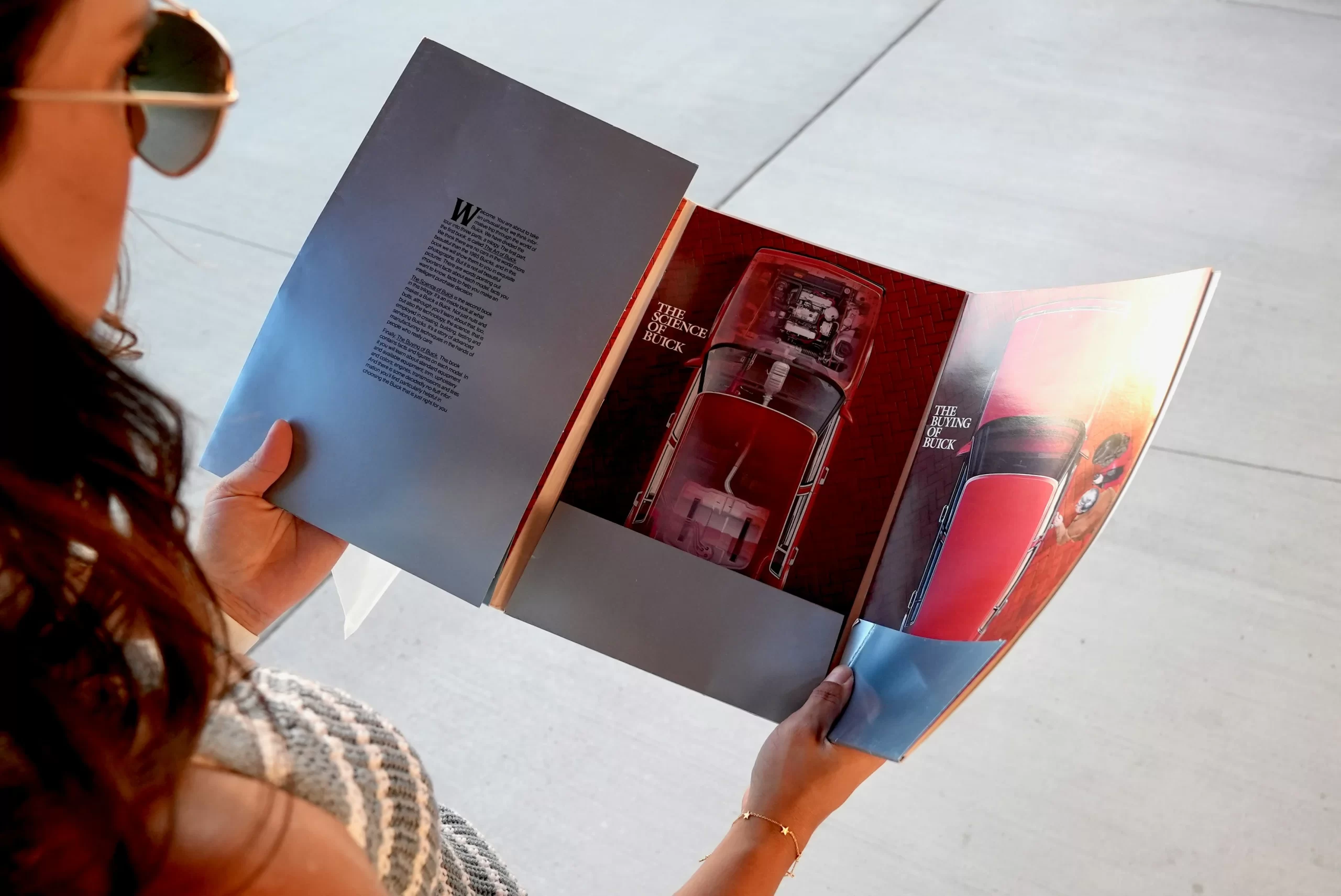
Gloss paper is one of the most popular choices for magazine interiors and covers.
Key Characteristics:
- Shiny, reflective finish
- Enhances color saturation
- Produces sharp image detail
- Smooth surface texture
Best For:
- Fashion magazines
- Photography-heavy publications
- Product catalogs
- Lifestyle magazines
Because gloss paper reflects light, it makes images appear vibrant and high contrast. However, it can create glare under bright lighting.
Tip: Use gloss paper when high-impact visuals are your priority and your magazine relies heavily on photography.
2. Matte Coated Paper

Matte paper offers a smooth, non-glossy surface with reduced glare.
Key Characteristics:
- Soft, elegant appearance
- Easier readability under bright light
- Subtle color finish
- Less reflective than gloss
Best For:
- Editorial magazines
- Corporate publications
- Thought-leadership pieces
- Art and literary magazines
Matte paper provides a sophisticated look while maintaining strong print quality. Colors appear slightly softer than gloss but still rich and professional.
Tip: Choose matte if readability and a premium aesthetic are more important than maximum shine.
3. Silk / Satin Paper
Silk (also called satin) paper sits between gloss and matte finishes.
Key Characteristics:
- Slight sheen
- Balanced color vibrancy
- Smooth but less reflective than gloss
- Professional finish
Best For:
- Corporate magazines
- Brand publications
- Real estate magazines
- High-end promotional materials
Silk paper is often chosen for projects that require vibrant imagery without excessive glare.
Tip: If you want the best of both worlds — strong visuals and reduced reflection — silk paper is a smart compromise.
4. Uncoated Paper
Uncoated paper has no surface coating, giving it a natural texture.
Key Characteristics:
- Textured feel
- Organic, tactile finish
- Absorbs ink more deeply
- Softer color reproduction
Best For:
- Artistic magazines
- Eco-conscious brands
- Minimalist publications
- Indie publishers
Uncoated stock gives magazines a modern, editorial feel. However, images may appear less crisp compared to coated stocks.
Tip: Use uncoated paper when your brand aesthetic prioritizes authenticity and texture over glossy visuals.
5. Premium & Specialty Stocks
Premium stocks elevate the perceived value of your magazine.
Options Include:
- Heavier cover stocks (100lb – 130lb cover)
- Textured finishes
- Recycled paper
- FSC-certified paper
- Soft-touch cover stock
These options are ideal for magazines meant to impress, circulate long-term, or serve as marketing assets.
Paper Weight Explained (GSM & lb)
Paper weight impacts durability and feel.
Common Interior Weights:
- 80lb text (lightweight, cost-efficient)
- 100lb text (standard magazine interior)
- 120lb text (premium feel)
Common Cover Weights:
- 80lb cover (light)
- 100lb cover (standard)
- 130lb cover (thick, high-end)
Heavier paper increases durability and perceived quality but also impacts mailing costs and total print pricing.
Tip: Match interior weight to page count. Thick interiors with high page counts may increase spine bulk and cost.
Comparison Table: Magazine Paper Types
| Paper Type | Finish | Color Vibrancy | Glare Level | Best Use |
|---|---|---|---|---|
| Gloss | Shiny | High | High | Photography-heavy magazines |
| Matte | Smooth, flat | Medium-High | Low | Editorial & corporate |
| Silk/Satin | Slight sheen | Balanced | Medium | Brand publications |
| Uncoated | Natural texture | Softer | None | Artistic / eco brands |
| Premium Stocks | Varies | High | Varies | High-end magazines |
How Paper Choice Affects Printing Method
Your paper selection may depend on whether you use digital or offset printing.
- Digital printing is ideal for short runs and may limit certain specialty stocks.
- Offset printing provides broader stock compatibility and consistent color control for large runs.
At Unique Print NYC, we offer both digital and offset magazine printing to accommodate short-run publishers and large-scale production.
Cost Considerations
Paper type directly impacts overall magazine printing cost.
Factors include:
- Paper weight
- Coated vs uncoated stock
- Specialty finishes
- Quantity ordered
- Page count
Gloss and matte stocks are typically moderately priced, while premium or specialty stocks increase per-unit cost.
Tip: Balance aesthetics with budget. Interior pages may use a standard stock while the cover uses premium paper for impact.
Durability & Longevity
If your magazine will be:
- Mailed
- Displayed long-term
- Used as a sales tool
- Distributed at events
Then durability matters.
Heavier coated stocks resist wear, moisture, and fingerprints better than lighter uncoated stocks.
Eco-Friendly Magazine Paper Options
Sustainable printing is increasingly important for NYC brands.
Options include:
- FSC-certified paper
- Recycled content paper
- Soy-based inks
- Aqueous coatings
These choices reduce environmental impact without sacrificing professional quality.
Tip: Eco-friendly stocks pair well with matte or uncoated finishes for a modern, responsible brand aesthetic.
Choosing the Right Paper for Your Magazine
To select the best paper:
- 1. Define your audience
- 2. Consider your brand image
- 3. Evaluate image vs text balance
- 4. Determine durability needs
- 5. Review your budget
- 6. Request printed samples
Paper is not just a material — it’s part of your brand experience.
Why Choose Unique Print NYC for Magazine Printing
- Expertise in paper selection and production
- High-quality digital and offset printing
- Custom magazine sizes and binding
- Fast turnaround for NYC businesses
- Professional guidance from start to finish
We help publishers, creatives, and businesses throughout NYC produce magazines that look exceptional and feel premium.
Magazine Printing Services
If you’re ready to bring your publication to life, explore our Magazine Printing Services to see available formats, sizes, and binding options.
Request a Quote
Need expert guidance on selecting the right paper? Contact Unique Print NYC today for a customized quote and paper recommendations tailored to your project.
Short-Run vs Bulk Magazine Printing: What NYC Brands Should Know
Magazine printing is not one-size-fits-all. The right print quantity depends on your audience size, distribution strategy, budget, and production timeline.
At Unique Print NYC, we help brands determine whether short-run digital printing or large-scale offset production makes the most financial and operational sense. If you’re exploring formats and paper options, you may also want to review our Ultimate Magazine Printing Guide for a complete overview.
What Is Short-Run Magazine Printing?
Short-run printing typically refers to quantities ranging from 25 to 500 copies, though this may vary by project.
Short runs are most commonly produced using digital printing, which allows for quick setup and minimal upfront costs.
Best For:
- Startups testing new publications
- Indie publishers
- Limited-edition magazines
- Event programs
- Internal corporate publications
- Small audience distributions
Key Benefits:
1. Lower Upfront Investment
No plate setup costs make digital printing cost-efficient at smaller quantities.
2. Faster Turnaround
Short runs can often be completed within a few days.
3. Flexible Updates
You can revise content between print batches without large financial risk.
4. Reduced Storage Needs
Print only what you need.
Tip: Short-run printing is ideal for testing demand before committing to larger production.
What Is Bulk Magazine Printing?
Bulk printing generally refers to 1,000+ copies and is usually produced using offset printing.
Offset printing requires plate setup but delivers cost efficiency at higher volumes.
Best For:
- National distribution
- Retail magazine sales
- Subscription-based publications
- Trade show mass distribution
- Marketing campaigns
Key Benefits:
1. Lower Cost Per Unit
The more you print, the lower the cost per magazine.
2. Consistent Color Accuracy
Offset provides superior color consistency across large runs.
3. Wider Paper & Finish Options
Certain specialty stocks and coatings perform best with offset production.
4. Professional Scalability
Ideal for brands with established circulation.
Tip: If your audience size is predictable and large, bulk printing maximizes ROI.
Cost Comparison: Short Run vs Bulk
| Factor | Short Run (Digital) | Bulk (Offset) |
|---|---|---|
| Setup Cost | Low | Higher (plate setup) |
| Cost Per Unit | Higher | Lower at scale |
| Turnaround Time | Faster | Slightly longer |
| Best Quantity Range | 25–500 | 1,000+ |
| Paper Options | Moderate | Extensive |
| Color Consistency | High | Very High |
When Should NYC Brands Choose Short-Run Printing?
Short-run printing works best when:
- You’re launching a pilot issue
- You expect frequent content updates
- Budget is limited
- Distribution is targeted or niche
- Time is critical
For example, a fashion startup debuting a seasonal lookbook in NYC may begin with 250 copies before scaling to 2,000 in the next issue.
When Bulk Printing Makes More Sense
Bulk printing is ideal when:
- Demand is confirmed
- Distribution channels are established
- Per-unit cost matters
- Your brand requires premium consistency
- You’re mailing or retail-distributing
For corporate annual reports or subscription magazines, bulk production significantly reduces cost per copy.
How Printing Method Impacts Quality
Digital Printing (Short Run)
- Excellent quality
- Faster setup
- Ideal for variable data
- Slightly higher per-unit cost
Offset Printing (Bulk)
- Industry-standard for magazines
- Precise color calibration
- Superior ink saturation
- Best for large quantities
At Unique Print NYC, we offer both digital and offset printing to ensure you’re not forced into a one-size-fits-all solution.
Turnaround Time Considerations
Speed is often a deciding factor in NYC’s fast-paced market.
Short-run digital printing:
- Faster file setup
- Fewer production steps
- Ideal for tight event deadlines
Offset bulk printing:
- Requires plate creation
- Involves press scheduling
- May include longer drying and finishing times
However, for well-planned campaigns, bulk printing timelines are highly efficient and predictable.
If your magazine supports a scheduled quarterly release, bulk production aligns well with long-term planning.
Storage & Distribution Strategy
Many brands overlook post-production logistics.
Short-run printing:
- Reduces warehouse storage
- Minimizes waste from unsold inventory
- Easier to distribute in phases
Bulk printing:
- Requires secure storage space
- May require coordinated shipping
- Often includes staged distribution planning
Tip: NYC-based brands with limited storage space frequently begin with moderate quantities to avoid logistical complications.
Risk Management: Testing Before Scaling
Many brands use a hybrid strategy:
- Print 250 copies (short run)
- Gather feedback and demand data
- Scale to 3,000+ copies if successful
This phased approach reduces risk while maintaining flexibility.
Environmental Considerations
Short runs reduce waste if demand is uncertain.
Bulk printing can be eco-efficient when:
- Using FSC-certified paper
- Leveraging optimized offset runs
- Minimizing repeat production cycles
Sustainable production depends on proper planning, not just quantity.
Choosing the Right Strategy for Your Magazine
Ask yourself:
- How large is my distribution list?
- Do I expect reprints?
- What is my total budget?
- Is time or cost more important?
- Will content change frequently?
The answer often determines whether short-run or bulk printing is best.
Why Choose Unique Print NYC for Magazine Printing?
- Digital and offset printing expertise
- Competitive pricing for both small and large runs
- Custom paper, binding, and finishing options
- Fast turnaround for NYC businesses
- Expert consultation on cost optimization
We help brands make strategic decisions — not just printing decisions.
Magazine Printing Services
Explore our Magazine Printing Services to compare binding options, paper types, and production timelines.
Request a Quote
Not sure whether short-run or bulk printing is right for you? Contact Unique Print NYC today for a customized quote and production recommendation.
Choosing the Right Binding for Your Project
Choosing the right booklet binding is essential to create a professional and functional product. The type of binding affects not only appearance but also durability, readability, and cost.
At Unique Print NYC, we help businesses, event organizers, and creatives select the ideal binding for booklets, whether for marketing materials, product catalogs, programs, or informational guides. This guide explores the most common binding types, their advantages, ideal use cases, and practical tips for selecting the right option.
1. Saddle-Stitch Binding
Saddle-stitching is the most popular and cost-effective binding method, ideal for small to medium page counts.
Key Benefits:
- Staples along the spine (usually 2–4 staples)
- Works best for 8–64 pages
- Opens flat for easy reading
Pros:
- Affordable and quick to produce
- Lightweight and flexible
- Ideal for small catalogs, event programs, and marketing brochures
Cons:
- Not suitable for large page counts
- Spine cannot accommodate thick pages
Tip: Use saddle-stitching for booklets that are primarily informational or promotional with moderate content.
2. Perfect Binding
Perfect binding is commonly seen in magazines, paperback books, and premium booklets.
Key Benefits:
- Glue-based spine
- Flat, clean edges
- Suitable for 24–200+ pages
Pros:
- Professional, polished look
- Spine can be printed with titles or branding
- Great for high-volume publications
Cons:
- Higher cost than saddle-stitching
- Less flexible than stapled booklets
Tip: Perfect binding is ideal for annual reports, product catalogs, or booklets intended for long-term use.
3. Coil / Spiral Binding
Coil or spiral binding uses a plastic or metal coil threaded through holes along the spine.
Key Benefits:
- Fully opens flat and rotates 360 degrees
- Ideal for training manuals, cookbooks, or instructional guides
Pros:
- Easy to handle and read
- Durable and long-lasting
- Can accommodate thicker page counts
Cons:
- Slightly more expensive than saddle-stitching
- Spine is not printable
Tip: Coil binding is perfect for interactive or frequently referenced booklets where readers need the pages to stay open easily.
4. Wire-O Binding
Wire-O binding is similar to coil binding but uses double-loop wire for a more professional finish.
Key Benefits:
- Sturdy double-loop metal wire
- Fully opens flat
- Works for medium to thick booklets
Pros:
- Elegant appearance for professional presentations
- Durable and allows 360-degree rotation
- Suitable for employee manuals, training guides, and event booklets
Cons:
- Slightly more expensive
- Not ideal for very thin booklets
Tip: Wire-O binding adds a premium look and feel while keeping the booklet functional and easy to handle.
5. Comb Binding
Comb binding uses a plastic comb inserted into punched holes along the spine.
Key Benefits:
- Flexible spine
- Easy to add or remove pages
- Common in office and educational settings
Pros:
- Inexpensive and quick
- Pages can be updated or replaced
- Good for manuals and instructional booklets
Cons:
- Less durable than coil or wire
- Spine does not print branding
Tip: Use comb binding when flexibility and affordability are the priority.
6. Choosing the Right Binding for Your Project
| Binding Type | Best For | Pages | Cost Range |
|---|---|---|---|
| Saddle-Stitch | Event programs, brochures | 8–64 | Low |
| Perfect Binding | Catalogs, annual reports | 24–200+ | Medium–High |
| Coil / Spiral | Training manuals, cookbooks | 20–200 | Medium |
| Wire-O | Professional manuals, presentations | 20–150 | Medium–High |
| Comb | Office manuals, flexible guides | 10–120 | Low |
Tip: Consider your page count, budget, and intended use when selecting binding.
7. Paper and Finish Considerations
- Gloss or matte paper affects readability and visual appeal
- Thicker paper improves durability for longer use
- Specialty finishes like UV coating or lamination protect and enhance the booklet
Tip: Match paper weight and finish to the binding type for optimal results.
8. Design Tips for Booklets
- Maintain consistent margins and safe zones near the spine
- Use clear headings and subheadings for readability
- Include high-quality images and graphics
- Keep text concise and engaging
9. Cost Considerations
- Saddle-stitch: most affordable, low page counts
- Perfect binding: higher cost, larger page counts, premium look
- Coil/Wire-O: moderate cost, functional and durable
- Paper type, finishing options, and quantity also affect pricing
Tip: Always request a quote and discuss binding options with your printer to stay on budget.
10. Why Choose Unique Print NYC for Booklet Printing
- Expert guidance on binding selection, materials, and design
- Professional digital and offset printing
- Large and small run capabilities for NYC businesses
- Fast, reliable NYC delivery and professional service
- Booklet Printing Services
- Request a Quote
How Much Should You Budget for Your Project
This guide from Unique Print NYC explains the factors that affect booklet printing costs, helping NYC businesses, event organizers, and creatives budget effectively. It covers pricing considerations including page count, size, binding type, paper choice, finishing options, and print quantity. The post also provides sample cost ranges, tips for balancing quality and budget, and advice for selecting the most cost-effective printing solutions without compromising professional results.
Depending on the type of project you are ordering printed booklets for you will want to consider all of the options available to ensure you choose the most appropriate type. Whether for personal, business, or creative use, the type of booklet you choose, the size, binding type, finishing options, and quantity can all affect the overall budget. At Unique Print, we have several team members on hand to guide you through the process and below is a good primer to introduce you to common options you’ll come across.
1. Key Factors That Affect Booklet Printing Costs
Page Count: More pages require more paper and labor.
Size: Larger formats cost more materials and printing time.
Binding Type: Saddle-stitch, perfect binding, coil, and Wire-O have different price points.
Paper Quality: Glossy, matte, or premium stocks influence cost.
Finishing Options: Lamination, UV coating, foil stamping, and embossing add to the budget.
Quantity: Bulk printing reduces per-unit costs but increases upfront investment.
2. Cost Breakdown by Page Count
| Page Count | Typical Cost Range | Notes |
|---|---|---|
| 8–16 pages | $1.50–$3 per unit | Small event or informational booklets |
| 20–32 pages | $3–$6 per unit | Medium catalogs or programs |
| 40–64 pages | $6–$10 per unit | Large marketing booklets, product catalogs |
| 65+ pages | $10+ per unit | Perfect binding recommended for durability |
Tip: Estimate cost per unit based on both page count and quantity to plan your budget accurately.
3. Cost by Binding Type
| Binding Type | Typical Cost | Notes |
|---|---|---|
| Saddle-Stitch | Low | Affordable, suitable for small page counts |
| Perfect Binding | Medium–High | Professional look, better for long-term use |
| Coil / Spiral | Medium | Durable and flexible, great for manuals |
| Wire-O | Medium–High | Premium finish, allows flat opening |
| Comb Binding | Low | Easy to add/remove pages, flexible |
4. Paper and Finish Options
Glossy Paper: Highlights images and colors
Matte Paper: Professional and glare-free
Heavyweight Stock: Adds durability
Specialty Finishes: UV coating, lamination, foil stamping for premium look
Tip: Choose paper and finish that aligns with binding type, intended use, and budget.
5. Quantity Considerations
Small runs: Higher per-unit cost but lower upfront investment
Large runs: Lower per-unit cost, higher total cost
Digital printing: Cost-effective for short runs
Offset printing: Better for bulk orders
Tip: Match quantity to distribution goals to optimize cost-efficiency.
6. Examples of Budget Scenarios
| Booklet Type | Quantity | Page Count | Binding | Estimated Total Cost |
|---|---|---|---|---|
| Event Program | 50 | 12 | Saddle-Stitch | $150–$250 |
| Product Catalog | 100 | 32 | Perfect Binding | $600–$1,000 |
| Training Manual | 25 | 40 | Coil Binding | $300–$500 |
| Premium Guide | 10 | 64 | Perfect Binding | $400–$700 |
7. Tips to Control Costs
- Finalize design early to avoid rush fees
- Select the right binding for page count and purpose
- Consider paper weight and finish carefully to avoid unnecessary cost
- Evaluate print method: digital vs. offset depending on quantity
8. Planning for Delivery and Extras
- Factor in NYC delivery or shipping costs
- Consider professional finishing or folding charges
- Include proofing and revisions in overall budget
9. Balancing Quality and Budget
- Higher-quality paper, finishes, and premium binding increase perceived value
- Avoid cutting corners on critical visual elements for cost savings
- Combine smart design, bulk ordering, and appropriate binding to maximize ROI
10. Why Choose Unique Print NYC for Booklet Printing
- Expert guidance on binding, page count, and paper choices
- High-quality digital and offset printing
- Custom sizes and finishes tailored for NYC businesses
- Fast delivery and professional service
- Booklet Printing Services
- Request a Quote
This guide from Unique Print NYC explains how to create high-quality photo booklets that showcase images professionally and effectively. It covers paper selection, color management, layout tips, binding options, and finishing techniques. NYC businesses, event organizers, and creatives can use this guide to produce polished, visually striking photo booklets for portfolios, catalogs, event programs, and promotional materials.
How to Print High-Quality Photo Booklets
Photo booklets require attention to image resolution, color accuracy, paper choice, and binding to ensure a professional appearance.
At Unique Print NYC, we help clients create photo booklets that preserve image quality, enhance visual impact, and deliver a premium printed product. This guide provides step-by-step advice for producing high-quality photo booklets for portfolios, product catalogs, event programs, and marketing materials.
1. Choose the Right Paper
Glossy Paper: Enhances color vibrancy and sharpness
Matte Paper: Reduces glare and provides a sophisticated look
Heavyweight Stock: Adds durability and professional feel
Specialty Papers: Consider textured or premium photo paper for luxury booklets
Tip: Paper choice directly impacts the quality and feel of your photo booklet.
2. Optimize Image Resolution
- Minimum 300 DPI (dots per inch) for crisp prints
- Ensure images are high-resolution and correctly cropped
- Avoid stretching images to fit page dimensions
Tip: Use original image files rather than compressed versions to prevent pixelation.
3. Color Management
- Convert designs to CMYK for print accuracy
- Calibrate monitors for consistent color representation
- Use color profiles recommended by the printer
Tip: Soft-proof your files digitally to anticipate color shifts before printing.
4. Select the Appropriate Binding
| Binding Type | Best Use | Notes |
|---|---|---|
| Saddle-Stitch | Small booklets, short page counts | Cost-effective, flexible |
| Perfect Binding | Large photo catalogs, portfolios | Professional look, durable |
| Coil / Spiral | Training manuals, interactive booklets | Fully opens flat |
| Wire-O | Premium photo portfolios | Elegant, functional, rotates 360° |
Tip: Match binding to page count and purpose to enhance usability and aesthetics.
5. Plan Layout and Design
- Use grid systems for consistent alignment
- Limit text overlays on images to avoid clutter
- Balance image size and white space for readability
- Include captions or brief descriptions for context
Tip: A clean, organized layout improves reader experience and highlights your images.
6. Incorporate Finishing Options
- Lamination or UV Coating: Protects images from scratches and fading
- Foil or Spot UV: Adds visual appeal to special sections
- Rounded Corners: Enhances durability and aesthetics
Tip: Select finishes that complement the overall style and use of your photo booklet.
7. Proof and Test Prints
- Print a sample copy to verify image quality and color accuracy
- Check for alignment, margins, and page sequence
- Adjust designs based on sample feedback
Tip: Testing ensures final print meets professional standards before bulk production.
8. Quantity and Budget Considerations
- Small runs may use digital printing for cost-effectiveness
- Larger runs benefit from offset printing for consistent color and lower per-unit cost
- Factor in paper type, binding, and finishing when calculating total budget
Tip: Planning quantities and materials ahead helps control costs without sacrificing quality.
9. Creative Ideas for Photo Booklets
- Event photo booklets for weddings, parties, or corporate events
- Product catalogs for marketing campaigns
- Portfolios for photographers, artists, or designers
- Seasonal or promotional booklets to showcase offerings
Tip: Customize layout and design based on audience and purpose for maximum impact.
10. Why Choose Unique Print NYC for Photo Booklets
- Expertise in high-quality photo printing and booklet design
- Digital and offset printing for all sizes and page counts
- Custom finishing and binding options for NYC businesses
- Fast, reliable service and delivery
- Booklet Printing Services
- Request a Quote
This guide from Unique Print NYC explains booklet finishing options, including lamination, foil stamping, UV coating, and specialty finishes. It covers the benefits, ideal use cases, and tips for selecting finishes that enhance durability, visual appeal, and professional quality. NYC businesses, event organizers, and creatives can use this guide to make booklets that look polished, stand out, and leave a lasting impression.
Booklet Finishing Options: Laminations, Foil, and Coatings
Booklet finishes can dramatically enhance the look, feel, and durability of printed materials. The right finishing choice helps NYC businesses create booklets that appear professional, stand out visually, and hold up to handling.
At Unique Print NYC, we provide guidance on finishes such as lamination, foil stamping, UV coating, and specialty options, helping clients select finishes that complement their design and purpose.
1. Lamination
- Gloss Lamination: Shiny, vibrant finish that enhances colors
- Matte Lamination: Smooth, non-reflective finish for a sophisticated look
- Soft-Touch Lamination: Velvet-like feel for premium presentation
- Benefits: Adds durability, protects against moisture and fingerprints, enhances perceived value
Tip: Lamination is ideal for high-traffic booklets, marketing materials, and event programs.
2. Foil Stamping
- Uses metallic foil to highlight text or design elements
- Available in gold, silver, or custom colors
- Works best on smooth surfaces like coated paper or specialty stocks
Tip: Foil stamping is perfect for invitations, high-end portfolios, or limited-edition booklets.
3. UV Coating
- Gloss or spot UV coating applied to selected areas or entire pages
- Enhances contrast, color, and visual depth
- Provides protection against scratches and wear
- Can create tactile effects for design highlights
Tip: Spot UV is ideal for logos, images, or callouts you want to draw attention to.
4. Specialty Coatings
| Finish Type | Description | Ideal Use |
|---|---|---|
| Soft-Touch Coating | Velvet-like feel, luxurious | Premium booklets, portfolios |
| Aqueous Coating | Water-based, eco-friendly protective layer | Environmentally conscious projects |
| Embossing / Debossing | Raised or recessed design elements | Adds tactile dimension to covers or logos |
Tip: Specialty coatings create a memorable tactile experience and elevate perceived quality.
5. Choosing the Right Finish
- Match the finish to the project’s purpose and audience
- Consider durability requirements: high-traffic booklets may need lamination
- Evaluate design elements that can be highlighted with foil or spot UV
- Test samples to ensure finishes look and feel as intended
Tip: Combining finishes strategically enhances visual impact and user experience.
6. Cost Considerations
- Lamination is moderately priced depending on type and coverage
- Foil stamping and specialty coatings add premium cost
- UV coating and embossing may increase per-unit price
- Digital printing may limit certain finishes compared to offset printing
Tip: Balance your desired aesthetic with budget to achieve professional results without overspending.
7. Durability Benefits
- Finishes protect pages and covers from moisture, fingerprints, and scratches
- Enhance longevity for booklets meant to last or circulate frequently
- Maintain professional appearance during handling and storage
Tip: Select finishes based on the intended lifespan and usage environment.
8. Combining Finishes for Impact
- Gloss lamination + spot UV for images or logos
- Matte lamination + foil stamping for a refined, professional loo
- Soft-touch coating + embossing for premium portfolios or event booklets
Tip: Thoughtful combinations can create booklets that are both durable and visually striking.
9. Eco-Friendly Finishing Options
- Water-based coatings and aqueous lamination are environmentally responsible
- Select finishes compatible with recycled or FSC-certified paper
- Avoid heavy chemical coatings for green-conscious projects
Tip: Eco-friendly finishes protect your booklet and the environment.
10. Why Choose Unique Print NYC for Booklet Finishes
- Why Choose Unique Print NYC for Booklet Finishes
- High-quality digital and offset printing for all page counts and sizes
- Custom solutions tailored for NYC businesses, events, and creatives
- Fast delivery and professional service
- Booklet Printing Services
- Request a Quote